We use cookies to enhance your browsing experience and analyse our traffic. By clicking “Accept All”, you consent to our use of cookies according to our Cookie Policy. You can change your mind any time by visiting out cookie policy.
A simple fitness metric from training data predicts parkrun pace with 87% accuracy (R² = 0.87 across 78 users). The speed-HR ratio measured during everyday runs explains the same fitness signal as a standardised 5km race.
Volume and frequency beat every "smart" training metric we tested. Across 13 ranked metrics, run frequency and total volume predicted parkrun pace as well as sophisticated models like CTL and Banister fitness. Showing up matters more than complexity.
There are two independent signals of fitness in your training data. CTL (training load) and speed-HR fitness barely correlate within individuals (r = 0.11), yet both predict race pace. One measures how much work you've done; the other measures how your body has adapted to it.
In the last few blogs, I have looked at how people in Europe are active, the types of activity that make people fitter, and, most recently, how to correlate people's activity with a basic fitness metric, a "speed-HR curve.” “External” inputs make any dataset considerably more valuable. So I wondered, could I find external validation for modeling fitness?
Unironically, I was jogging along, thinking about this problem, and realized I just needed a standardized activity that many people do frequently. Enter Parkrun.
There are a bunch of ways to estimate fitness. Why is this important? Because any app or software that advises athletes on how to train has to use some form of fitness metric. A model needs an output, and one of the wonderful things about endurance sport is that the ultimate output, race performance, isn’t a nice and clean objective one. So, having a way to analyze a metric, aligning a large data set with a “controlled” output is gold.
I started with a large database of nearly a million activity sessions recorded on wearable devices and went looking for Parkruns, a running activity of approximately 5 km, recorded on a Saturday morning between 08:30 and 09:30 local time. I then matched the GPS start coordinates of each activity to known Parkrun locations, confirming that these efforts were taking place at real Parkrun venues rather than coincidental Saturday-morning 5 km runs.
This gave me 1,613 parkrun-shaped activities from over 100 users, a natural laboratory of standardized 5 km efforts, none of which the athletes had to be asked to do.
Parkrun is close to a perfect natural experiment for validating a fitness metric. It is a standardized distance, on the same course, run repeatedly by the same people, under free-living conditions. It is the closest thing to a controlled lab test that happens in the wild, with no experimenter involved. The question was straightforward: Does the speed-HR curve I built in my last blog, a lab-free fitness metric computed entirely from training data, actually predict how fast someone runs when it matters?
Quick disclaimer, firstly, the obvious one that wearable data is messy and even though we do all that we can to clean it, we have to stay aware of this. I am also aware that HR is far from a perfect metric for predicting fitness, and the literature is full of reasons for this, especially at lower intensities. The purpose of this article is not to discuss the methods' limitations, but rather to determine whether we can find useful ways to model fitness using the data at our disposal.
Connecting Training Data to Race Performance
Of the 106 parkrun users, 80 also had enough training runs to compute a speed-HR curve (at least 20 runs over 6+ months). The speed-HR metric is simple: for each user, I take the ratio of their average speed to their average heart rate across training runs in the preceding 90 days. A higher ratio means you are running faster for the same cardiac cost. You are fitter. Crucially, the speed-HR metric and the parkrun times are computed from completely independent data. The speed-HR curve uses only training runs. The parkrun data is the test. The two streams never see each other.
Both measures capture the same physiological signal: aerobic efficiency. If the training-derived metric is measuring something real, it should predict the parkrun-derived metric with high fidelity.
The Validation
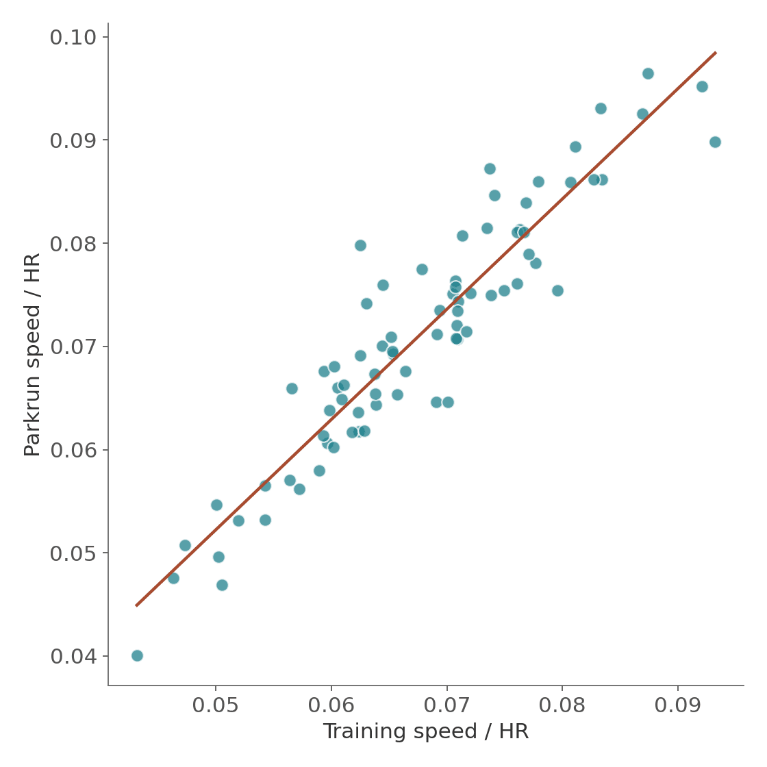
The first chart states the obvious. Each dot is one user, their average speed/HR ratio from training on the x-axis, their average speed/HR ratio at parkrun on the y-axis.
Figure 1: Training speed/HR vs Parkrun speed/HR scatter, r = 0.93. R² = 0.87. Across 78 users, the speed-HR ratio measured from everyday training runs explains 87% of the variance in the same ratio measured under standardized race conditions.
In plain terms: if I know your training speed-HR ratio, I can predict your parkrun speed-HR ratio with remarkable accuracy. The two are measuring the same thing, aerobic efficiency, just in different contexts.
Does It Track Over Time?
The cross-user result is strong, but the more demanding test is whether the metric tracks fitness changes within a single person. If a user's training speed-HR improves over months, does their parkrun speed-HR improve too?
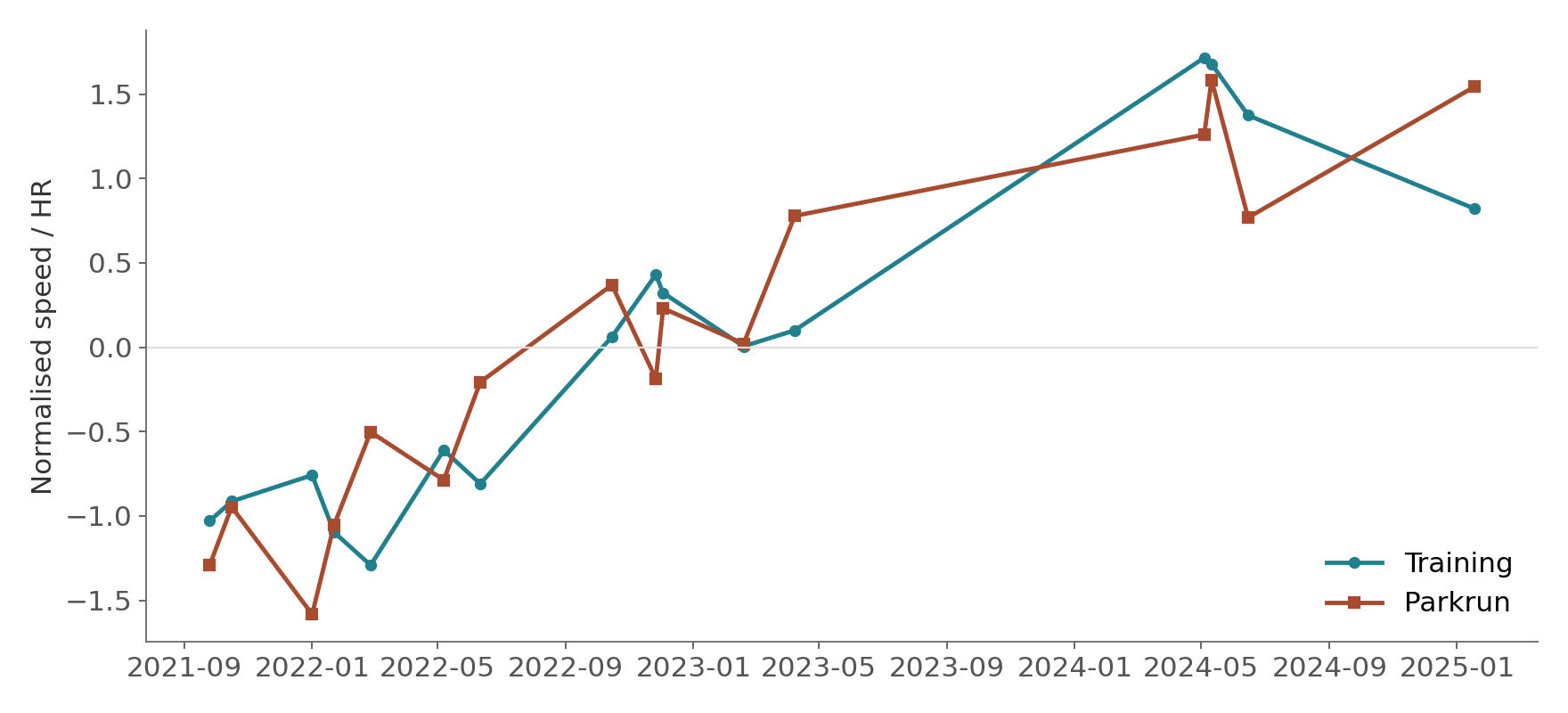
The chart below shows one user over three years. I have normalized both metrics to the same scale so they can be plotted on a single axis.
Figure 2: Example user timeseries, training and parkrun speed/HR tracking together
The two lines move together. This user's within-user correlation is r = 0.87. As their training efficiency rose, so did their “control” efficiency. When training dipped, so did Parkrun performance. This can be interpreted as the metric not just capturing who is fast, it is successfully capturing who is getting fitter and who is getting slower.
Across 72 users with at least 3 matched Parkruns, the median within-user correlation is r = 0.36, modest but meaningful given the noise in free-living data, where weather, pacing effort, and course conditions all vary between Parkruns.
Get the latest Terra Research reports and insights every week as soon as they're published.
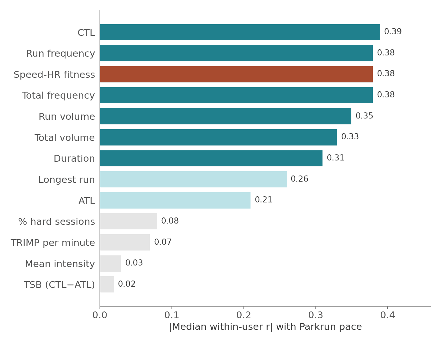
I tested 13 training metrics against Parkrun pace on the same matched set of 33 users, all computed within-user to strip out between-person confounding.
A note before the numbers: our CTL (Chronic Training Load) and ATL (Acute Training Load) are computed from session-average heart rate, not second-by-second data. A proper Bannister TRIMP integrates heart rate continuously across a session, weighting every second by how hard your heart is working. What we have is a single average HR per session, which means a steady 60-minute tempo run and a set of hard intervals with recoveries at the same average HR get identical TRIMP scores. Our CTL and ATL are approximations.
Figure 3: All metrics ranked by within-user median |r|. The larger r, the better. It shows the metric is “better” at predicting Parkrun pace. Note Frequency is hard to beat, mirroring earlier findings.
Training metric
Within-user median r
How it is computed
CTL (Banister fitness)
−0.39
42-day exponentially weighted TRIMP average
Run frequency (sess/wk)
−0.38
Number of running sessions per week
Speed-HR fitness
−0.38
Rolling speed-HR curve shift vs baseline
Total frequency (sess/wk)
−0.38
All aerobic sessions per week
Run volume (km/wk)
−0.35
Weekly running distance
Total volume (km/wk)
−0.33
All-sport weekly distance
Duration (hrs/wk)
−0.31
Total training hours
Longest run (km)
−0.26
Longest single run that week
ATL (Banister fatigue)
−0.21
7-day TRIMP average — but wrong sign for fatigue
% hard sessions
−0.08
Near zero
TRIMP per minute
−0.07
Near zero
Mean intensity
+0.03
Essentially no signal
TSB (fitness minus fatigue)
−0.02
The Banister composite — no signal
The speed-HR metric sits third in the table, tied with run frequency and just behind CTL. On a matched user set, it performs as well as any traditional training metric and crucially, it measures something fundamentally different.
Two Independent Fitness Signals
This is the finding that I think is most interesting. CTL and speed-HR fitness are barely correlated within individuals, median within-user r = 0.11. They are measuring different things entirely:
CTL captures how much training you have accumulated. It is a load metric. It knows how much work you have done, weighted by heart rate, but it does not know how your body has responded to that work.
Speed-HR fitness captures the physiological adaptation. We can think of it as measuring whether your aerobic engine has actually improved, whether you can sustain a faster pace at the same cardiac cost. It does not know how much you trained, only whether you got fitter.
Speed-HR wins for 15 of 33 users. CTL wins for 18. Neither dominates. They attack fitness from orthogonal directions.
The Wider Leaderboard
To put all of this in context, here is how the full suite of training metrics performed across the three analytical approaches I described in my previous work; within-user tracking, paired before-and-after comparisons, and heart rate efficiency, tested on the full park run cohort.
Training metric
Approach 1: Within-user
Approach 2: Paired delta
Approach 3: HR efficiency
Run volume (km/wk)
r = −0.43
r = −0.36
r = −0.30
Total volume (km/wk)
r = −0.41
r = −0.47
r = −0.26
CTL (Banister)
r = −0.40
r = −0.44
r = −0.26
Run frequency
r = −0.37
r = −0.35
r = −0.28
Total frequency
r = −0.37
r = −0.33
r = −0.28
Duration (hrs/wk)
r = −0.30
r = −0.24
r = −0.25
ATL (Banister)
r = −0.28
r = −0.30
r = −0.16
Mean intensity
r = −0.12
r = −0.15
r = −0.21
Longest run (km)
r = −0.09
r = −0.22
r = −0.23
% hard sessions
r = −0.09
r = −0.01
r = −0.15
TRIMP per minute
r = −0.05
r = −0.04
r = −0.16
TSB (CTL−ATL)
r = 0.00
r = −0.01
r = −0.04
The pattern is consistent. Volume and frequency dominate (again!) Intensity (as measured in terms of session average) adds almost nothing. And the Bannister model's fitness-minus-fatigue composite (TSB) shows no signal at all, more on that below.
A Note on the Bannister Model
The Bannister impulse-response model predicts that performance is fitness minus fatigue, CTL minus ATL. If that is true, TSB (the difference) should be a strong predictor: positive TSB means you are fit and rested, negative means you are carrying fatigue.
But TSB shows essentially zero correlation with park run pace across all three approaches (r = 0.00, −0.01, −0.04). The fitness-minus-fatigue composite does not predict 5 km performance in this dataset.
ATL on its own does correlate with pace, but in the wrong direction for a fatigue signal. Higher ATL (more recent training load) associates with faster park runs (r = −0.28), not slower ones. ATL is behaving as a second fitness signal, not a fatigue signal.
That could makes sense at this level: a week of high training load means you have been training hard recently, which on average means you are fitter. In a joint model with both CTL and ATL, only 5 of 15 highest-adherence users show the expected positive ATL coefficient (more fatigue = slower). For the majority, more recent load means faster running.
One likely reason is that Parkrun happens weekly, and most people in this dataset are not “tapering” for it. They are just showing up on Saturday morning during normal training. In my opinion that is a core part of it’s value! In a dataset of athletes peaking for specific races after deliberate tapers, TSB might tell a different story.
Disentangling Volume and CTL
Run volume and CTL are almost perfectly correlated in this dataset, r = 0.94 pooled, median r = 0.86 within individuals. They are measuring nearly the same thing. So which one is actually doing the work?
I ran partial correlations, controlling for run volume and asking whether CTL adds anything beyond simple distance.
Metric (controlling for run volume)
Strict (15 users) partial r
Relaxed (38 users) partial r
Cross-training volume
−0.27***
−0.20***
Longest run
−0.19***
−0.12**
Mean intensity
−0.12*
−0.13**
CTL (Banister)
−0.07 (NS)
−0.02 (NS)
Controlling for run volume, CTL drops to non-significance in both cohorts. But the reverse test tells a more nuanced story. Using residual analysis, stripping the shared variance and testing only the orthogonal components, the unique component of CTL (the part that run volume cannot explain) still correlates with pace: r = −0.18, p < 0.001. The unique component of volume does not: r = −0.06, p = 0.24. CTL subsumes volume, not the other way around. But the advantage is modest — ΔR² of about 0.03.
Coming back to the TRIMP limitation I flagged earlier. Our CTL and ATL are computed from session-average heart rate a 60-minute run at an average of 150 bpm could be a steady tempo effort or a set of hard intervals with recoveries, and our data treats them identically.
A proper Bannister TRIMP integrates HR second by second, weighting higher heart rates exponentially more, we will dive into this in the next analysis. That would almost certainly increase the CTL signal and might change the volume-vs-CTL story.
It would also improve the speed-HR metric, which currently bins session-average heart rate rather than using the full within-session distribution.
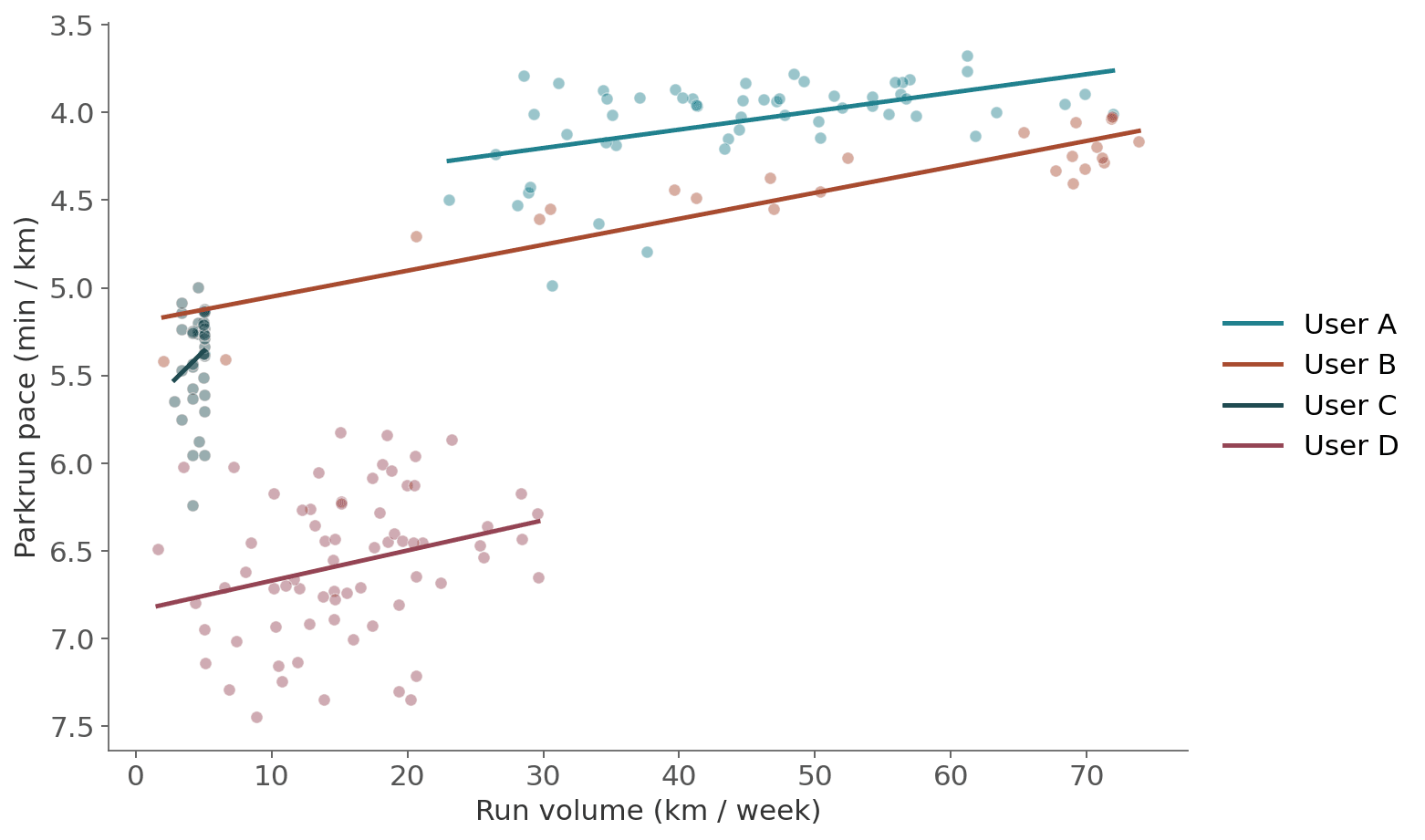
Figure 4: Individual plots of volume and pace. Volume as a strong predictor, is something we keep seeing in wearable data analysis.
Why These Correlations Are Stronger Than They Look
In free-living wearable research, explaining 14–19% of performance variance from a single training metric is a strong result. Most wearable-derived metrics explain low single-digit percentages. The cross-user validation at R² = 0.87 is exceptional, it indicates that the training metric captures the same underlying signal as a standardized race.
What This Means
Three things stand out from this analysis I think.
First, the speed-HR curve works. It may be simple but as lab-free fitness metric computed from session-average wearable data it predicts the same metric measured under standardized race conditions at r = 0.93.
We would expect this, we are looking at the same thing. Within individuals, it tracks fitness changes over time. It is not a noisy proxy, it looks like it’s capturing real physiological adaptation.
Second, volume predicts performance as well as or better than any sophisticated metric. Run more kilometers per week and you will run faster at park run. Not harder kilometers. Just more of them. The top of every leaderboard is dominated by volume and frequency metrics. This is a signal that keeps appearing from our data.
Third, fitness-from-training-load (CTL) and fitness-from-physiological-adaptation (speed-HR) are nearly independent signals. They correlate at r = 0.11 within individuals, yet both predict park run performance equally well. One measures the dose. The other measures the response. The fact that both independently predict the outcome, from different angles, is the strongest evidence that the underlying signal is real.
References
References
Banister, E. W. (1975). A systems model of training for athletic performance. Australian Journal of Sports Medicine, 7, 57–61. (See also: Clarke, D. C., & Skiba, P. F. (2013). Rationale and resources for teaching the mathematical modeling of athletic training and performance. American Journal of Physiology.)
Pobiruchin, M., et al. (2017). Accuracy and Adoption of Wearable Technology Used by Active Citizens: A Marathon Event Field Study. JMIR mHealth and uHealth, 5(2), e24. https://mhealth.jmir.org/2017/2/e24/
Neshitov, A., et al. (2023). Estimation of cardiorespiratory fitness using heart rate and step count data collected from wearable devices. Frontiers in Physiology. https://pmc.ncbi.nlm.nih.gov/articles/PMC10517160/
Haake, S. (2020). The Role of Technology in Promoting Physical Activity: A Case-Study of parkrun. Proceedings, 49(1), 80. https://www.mdpi.com/2504-3900/49/1/80
Summary questions
Can wearable training data actually predict my race performance?
Yes, and the correlation is remarkably tight. Across 78 users, a simple speed-to-heart-rate ratio computed from everyday training runs explained 87% of the variance (r = 0.93) in the same ratio measured at parkrun under standardized race conditions. The training-only metric and the race data never overlapped, yet they capture the same aerobic efficiency signal.
Why is parkrun such a good way to validate a fitness metric?
Because it's the closest thing to a controlled lab test happening in the wild. By filtering nearly a million wearable sessions for ~5 km runs on Saturday mornings between 08:30 and 09:30 and matching GPS starts to known parkrun venues, the analysis identified 1,613 parkrun-shaped activities from over 100 users. Same course, same distance, repeated by the same people under free-living conditions — no experimenter required.
Does training volume really matter more than intensity?
Overwhelmingly, yes. Across all three analytical approaches, run volume (r = −0.43 within-user) and frequency (r = −0.37) topped the leaderboard, while mean intensity (r = −0.12) and percent hard sessions (r = −0.09) added almost nothing. The pattern is consistent: more kilometers per week predicts faster parkruns, and harder kilometers don't add much on top.
Does the Banister fitness-minus-fatigue model (TSB) predict 5K performance?
Not in this dataset. TSB showed essentially zero correlation with parkrun pace across all three approaches (r = 0.00, −0.01, −0.04). Even more counterintuitively, ATL — supposedly a fatigue signal — correlated negatively with pace (r = −0.28), meaning higher recent load was associated with faster parkruns. Because most users aren't tapering for a weekly Saturday 5K, ATL behaves like a second fitness signal, not fatigue.
Is CTL (chronic training load) really better than just tracking weekly kilometers?
Barely. Run volume and CTL are nearly identical in this dataset (r = 0.94 pooled, median r = 0.86 within-user). When you control for volume, CTL's predictive power drops to non-significance, though its unique residual component still correlates with pace at r = −0.18 — beating the unique component of volume (r = −0.06). CTL subsumes volume, but the added value is modest, around a ΔR² of 0.03.
Can a wearable metric track my fitness changes over time, not just rank me against others?
Yes, though more noisily. The example user shown across three years had a within-user correlation of r = 0.87 between training speed-HR and parkrun speed-HR. Across 72 users with at least three matched parkruns, the median within-user correlation was r = 0.36 — modest but meaningful given weather, pacing, and course variability in free-living data.
How does this compare to other wearable health metrics I see in apps?
It's exceptional by wearable-research standards. Wearable sleep metrics typically explain 1–3% of next-day performance variance, and wrist-based VO2max estimates explain 10–20% against lab gold standards. This study's training-load metrics explained 14–19% of within-user parkrun variance, and the cross-user speed-HR validation hit R² = 0.87. Most wearable signals operate in the low single digits — this one doesn't.
Why are CTL and the speed-HR curve both useful if they predict the same outcome?
Because they measure orthogonal things. Within individuals they correlate at only r = 0.11, yet both predict parkrun performance roughly equally — speed-HR wins for 15 of 33 users, CTL for 18. CTL captures the training dose you've accumulated; speed-HR captures whether your body actually adapted to it. Combining a dose metric with a response metric is more informative than doubling down on either alone.