We use cookies to enhance your browsing experience and analyse our traffic. By clicking “Accept All”, you consent to our use of cookies according to our Cookie Policy. You can change your mind any time by visiting out cookie policy.
We matched 532 Terra users across three marathons against 65,000 official finishers. In Berlin, our sample was 26 minutes faster with nearly three times the sub-3 rate.
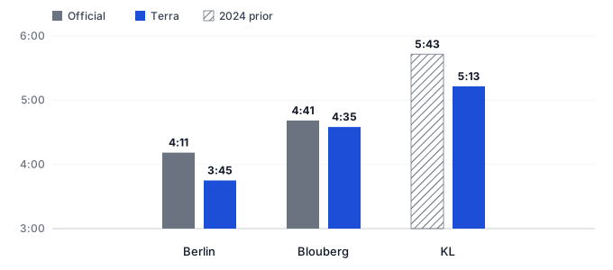
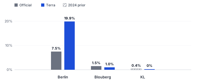
Terra users ran Berlin 26 minutes faster than the official field. 267 users had a median of 3:45 against 4:11 for 50,012 finishers, with 19.9% under three hours versus 7.5%.
In Blouberg the sample matched the race. 99 users had a median of 4:35 against 4:40 for 2,508 finishers, and sub-3 rates of 1.0% and 1.5%. Same pipeline, different crowd.
A “faster than 70% of runners” badge ranks you against people who own the same watch. That group is usually faster than a race field, so the badge can undersell you.
Last week, I found three big city marathons in the Terra database: Berlin, Kuala Lumpur, and Cape Town's Blouberg. The same week, three races. I got a bit excited.
267 Terra users ran Berlin. 166 ran Kuala Lumpur. 99 ran Blouberg. Then I lined them up against the official timing files. In one race, our users looked almost exactly like the field. In the other two, they didn’t.
So, which one? Have a guess before you read on.
I would have said Berlin. It’s the biggest sample, best-known race, the course everyone goes to for a fast time. Wrong. Berlin was the worst of the three. Our users were 26 minutes faster than the real field and almost three times as likely to break three hours. The closest was Blouberg, the smallest sample of the lot.
It is easy to look at a median and a sub-3 rate and assume that the numbers are “speaking for” the whole population, or marathon field in this case. What you actually have is the people on our database who happened to run those courses. That is selection bias (sometimes called sampling bias), and it is a dangerous one because it’s hard to spot.
Put simply: you have a data set you think is the same as the population. It isn’t. And if you wear a running watch, this probably applies to you too. More on that at the end.
Quick answers
Which marathon did the wearable data get right? Blouberg. The smallest sample (99 Terra users) matched the official field. Berlin, the biggest, was the furthest off: 26 minutes faster on the median, and almost three times the official sub-3 rate.
Are running-watch percentile rankings accurate? Only relative to other people who sync a similar watch. That group is usually faster than a real race field, so the badge can undersell you against actual runners.
What went wrong in Berlin? Selection bias. A large, clean sample of wearable users is still a sample of wearable users, not of the marathon.
Get the latest Terra Research reports and insights every week as soon as they're published.
I run a mass-start detector on the Terra database. It looks for unusual numbers of distinct users starting within a few kilometres of each other, on a day that does not usually look like that. For someone to land in an event bucket they have to start near the start line, near the start time, and then run close to the advertised distance. Then I clean a bit, so a parkrun that wandered through the same coordinates does not sneak in.
The filter is defensible. I can be pretty confident they ran the event I think they ran. What is not obvious is who is missing. These users wear a connected device, sync to a Terra-connected app, record GPS, and look like they finished the distance. That is not everyone who finished.
Berlin was 27 September. KL Standard Chartered was 4 October. Intercare Blouberg was 3 October.
Berlin
Official field, Mika Timing chip times: 50,012 finishers. Median 4:11:19. 7.47% under three hours. Winner 2:02:50.
Terra: 267 users. Median 3:45. 19.9% under three hours. One user in the 2:15–2:20 band. About seventy percent COROS.
Coverage is half a percent. The sample is 26 minutes faster than the field and almost three times as likely to break three hours.
Two hundred and sixty-seven is a large sample. Unfortunately it is large enough to be sure about the wrong race. If you published “Berlin 2026 from wearables” from this, you would describe a faster, more serious amateur race than the one that happened.
Why? Everyone in the Terra sample uses a wearable. Not everyone in a city marathon does. The people who sync to us are probably more active, and more likely to have travelled for a destination marathon. Nothing in the sample tells you that. The official list does.
Blouberg
Official field, Mobii Elite: 2,508 finishers. Median 4:40:38. 1.48% sub-3. Winner 2:35:36.
Terra: 99 users. Median 4:35. 1.0% sub-3. One user in the 2:55–3:00 band. About seventy-two percent Garmin.
Coverage is about 4%. The medians are close. The sub-3 rates are very similar. We still miss the very sharp end of the club athletes, but the pack is the pack.
Why does this one work? It is a Comrades / Two Oceans qualifier. Local Garmin club culture happens to look like Terra’s South African base. Selection into the database looks like selection into the race. That is luck!
Kuala Lumpur
I cannot get the full 2026 results. The organiser posts them as a lookup, so I cannot compute a field median. I can see the podiums, and I can see 2024.
In 2024 the two mass Malaysian men’s categories were 8,046 finishers, medians 5:40 and 5:45. International open categories were faster and much smaller. Known sub-3s were about 0.4%. This year’s winners were 2:21 and 2:39. Hot, humid, slow. That part makes sense.
Terra 2026: 166 users. Median 5:13. Zero sub-3. Two users in the 3:10–3:15 band, nobody faster. Almost all COROS. Coverage 1.28%, though that is against 12,964 participants rather than finishers.
Against that prior, 5:13 is about 30 minutes faster than the Malaysian mass, and in line with 2024 Open men. The prior only covers Malaysian men, while our users probably include women and international runners, so treat this as a rough comparison rather than a like-for-like one. This year’s winner was slower than 2024 (2:21 vs 2:18). If the field slowed with the elite, Terra looks more biased, not less.
The Comparison
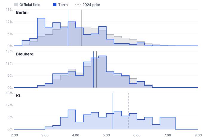
Chart 1. Share of finishers in each 15-minute band, 2:00–8:00. Berlin’s Terra pack sits left of the official field. Blouberg overlays. KL has no 2026 time list, so Terra only, with last year’s Malaysian-men median as a dashed line.
Berlin
KL
Blouberg
Official n
50,012 finishers
12,964 participants
2,508 finishers
Terra n
267
166
99
Coverage
0.53%
1.28%
3.95%
Official median
4:11:19
5:43 (2024 prior)
4:40:38
Terra median
3:45
5:13
4:35
Δ median
−26 min
−30 min
−6 min
Official sub-3
7.47%
0.4% (2024 prior)
1.48%
Terra sub-3
19.9%
0%
1.0%
Official winner
2:02:50
2:21:16
2:35:36
Terra sharp end
1 user, 2:15–2:20
2 users, 3:10–3:15
1 user, 2:55–3:00
Chart 2. Median finish. KL’s official bar is the 2024 Malaysian-men prior (5:43), not a 2026 chip-time median.Chart 3. Share under 3:00. KL official is the 2024 prior (~0.4%).
How can I tell if the sample matches the field?
The usual way to test this is to treat the official file as the population, and ask whether our times could have been a random draw from it.
We normally use two tests for this. A chi-square goodness-of-fit test asks whether Terra users land in each time band at the same rate as the field. A Kolmogorov–Smirnov test looks at the whole curve: the biggest gap between the two cumulative distributions. For one given value, such as the share under three hours, a binomial test against the official proportion is enough. A t-test is the wrong tool here.
The times are not normally distributed, and a t-test only asks “are they faster on average?”, which is a narrower question than “does this sample look like the field?” A non-significant p-value does not prove the sample is the field; it means a sample this size did not detect a difference. The other trap is precision. A big sample gives a tight estimate and a confident answer, but only about the people in it. Berlin’s n is big enough to be sure, and still wrong. Berlin fails every test, and Blouberg passes them.
The sampling traps I need to look out for
1. n looks like a population.
Two hundred finishers feels like “enough.” Enough for what? Enough to estimate this sample’s median. Not enough to stand in for 50,000 other people (they did not sync a GPS watch we can see). Representativeness is not a sample size. It is a statement about who is missing.
2. The same filter, different bias.
Berlin and Blouberg data were selected in an identical way. The bias changed anyway. A pipeline that is “fair” across races is not unbiased across races. Fairness of method is not fairness of sample. The device mix is a clue: about seventy percent COROS in Berlin and almost all COROS in KL, but about seventy-two percent Garmin in Blouberg. Different devices, different communities, different selection.
3. Comparing samples as if they were races.
Terra Berlin 3:45 versus Terra KL 5:13 is a real contrast in our users. It's not just Berlin versus Kuala Lumpur; the actual users are probably very different, and the event and conditions (and many other factors) may also differ, but we can’t make assumptions about any of them.
4. Treating gaps in our data as a finding.
KL Terra has zero sub-3s. The published podiums are full of times we do not have. Absence in the warehouse is not absence on the course. Absence of evidence is not evidence of absence.
5. Being sure.
Berlin’s Terra median is not noisy. That is the trap. Selection bias does not widen your error bars. You can get a tight estimate of the wrong population and call it science.
What about your watch?
Every “you’re faster than 70% of runners” badge hides the same question. 70% of whom?
If the comparison is with other people who wear the same device and sync their runs, you are being ranked against something that could look more like the Terra Berlin sample than the whole Berlin field. That group is probably fitter and keener than the person next to you on the start line.
It isn’t all bad news. If that group is faster than the real field, your percentile is probably lower than it would be in the actual race. Your watch might be underselling you!
So next time an app tells you where you rank, ask who it is comparing you with. If the answer is “people who own this watch”, that is a real number. It just isn’t the same as “runners.”
Kuala Lumpur Standard Chartered Marathon 2026 top results: kl-marathon.com
Kuala Lumpur Standard Chartered Marathon 2024 results (prior year for the Malaysian-mass comparison): kl-marathon.com 2024
Summary questions
Which marathon did wearable data actually represent accurately?
Blouberg — the smallest sample of the three. With just 99 Terra users against an official field of 2,508 finishers, the medians were only 6 minutes apart (4:35 vs 4:40:38) and the sub-3 rates were nearly identical (1.0% vs 1.48%). The biggest sample, Berlin with 267 users, was the furthest off.
How wrong was the Berlin wearable sample compared to the actual field?
Dramatically. Terra's 267 Berlin users had a median finish of 3:45 versus the official 4:11:19 — a 26-minute gap. They were also almost three times as likely to break three hours (19.9% vs 7.47%). A large, clean sample still described a faster, more serious race than the one that actually happened.
Why did Blouberg work when Berlin didn't, using the exact same filtering method?
Luck of overlap. Blouberg is a Comrades and Two Oceans qualifier with a strong local Garmin club culture (about 72% Garmin in the sample) that happens to mirror Terra's South African user base. In Berlin, the wearable-wearing, destination-marathon-travelling crowd skewed much faster than the general field. Identical pipeline, completely different bias.
Isn't 267 runners a big enough sample to represent a marathon?
No — and that's the trap. 267 is more than enough to tightly estimate the median of that sample, but it tells you nothing about the 49,745 Berlin finishers who weren't in it. Representativeness isn't about sample size; it's about who's missing. Selection bias doesn't widen your error bars, so you can be very confident about the wrong population.
Are the percentile rankings on my running watch actually accurate?
Only relative to other people who sync a similar device. That group tends to be fitter and more committed than the real race field — closer to the Terra Berlin sample (26 minutes faster than reality) than to the actual Berlin starters. The upside: if your watch compares you against a faster-than-reality cohort, your true percentile against actual runners is probably better than the badge suggests.
Why can't I just use a t-test to check if a wearable sample matches the race?
Because marathon times aren't normally distributed, and a t-test only asks whether the averages differ — a much narrower question than whether the whole distribution matches. The right tools are chi-square goodness-of-fit (do runners land in each time band at the field's rate?) and Kolmogorov–Smirnov (biggest gap between cumulative distributions). For a single metric like sub-3 rate, a binomial test against the official proportion does the job.
Does zero sub-3 finishers in the KL wearable data mean nobody ran that fast?
No. KL's published podiums include a 2:21 winner — a time nowhere in the Terra data. Terra had 166 KL users with a median of 5:13 and nobody faster than the 3:10–3:15 band, but that's absence in the warehouse, not absence on the course. Treating gaps in a wearable dataset as a finding about the race is one of the easiest sampling mistakes to make.
Can wearable data ever stand in for official race results?
Only when the people who sync devices happen to resemble the people who run the race — and you usually can't tell that in advance without the official file to check against. Coverage ranged from 0.5% in Berlin to 4% in Blouberg, and higher coverage didn't guarantee a better match. Wearable data is powerful for describing wearable users; using it as a proxy for a full marathon field requires validation against ground truth, not a leap of faith.