We use cookies to enhance your browsing experience and analyse our traffic. By clicking “Accept All”, you consent to our use of cookies according to our Cookie Policy. You can change your mind any time by visiting out cookie policy.
How do runners actually get faster? We analyzed 856,000 running activities to find out who actually gets faster. It wasn't the intense ones, but rather the consistent ones. Showing up month after month beat everything flashier. Boring, as it turns out, is fast.
Most runners don't actually get faster — about half the field improved their speed-at-heart-rate over a year of training, and about half declined. The average runner essentially stayed where they started.
Consistency beat intensity, every time — the biggest predictor of getting faster wasn't how hard runners trained, but how reliably they showed up. Month-to-month consistency outperformed every other variable tested.
Hard sessions without volume trended backwards — runners who pushed nearly half their sessions at high intensity but ran less overall actually got slower on average. The dose-response was clear: volume and consistency drove improvement, not intensity in isolation.
In my previous Terra Research work on marathon training, I linked training patterns to race-day performance. The findings were striking; more easy running predicted faster finishes, excessive intensity predicted slower ones. But there was always a problem underlying that analysis: a marathon is a single event, and people don't always run at their maximum. Some are pacing for a friend. Some blow up at mile 20. Some treat it as a training run. Tying months of preparation to one imperfect data point felt like it was leaving signal on the table.
As I continued to plug away on the European activity dataset I've written the previous two articles on, I realized I could ask a different question. Instead of linking training to a race result, could I use the training data itself to measure fitness change? No event required. No assumptions about effort on the day. Just the relationship between how fast someone runs and how hard their heart is working, tracked over time, across thousands of people.
The speed-HR curve is one of the oldest tools in exercise physiology. If you can run faster at the same heart rate, your aerobic engine has improved. The question was whether this approach — applied at scale to noisy, real-world wearable data from consumer devices — would actually detect anything meaningful. Or whether it would drown in noise.
The answer from 641 runners and five independent analytical approaches came back remarkably clearly.
How I Measured Aerobic Fitness Using Heart Rate
Performance is notoriously hard to measure from wearable data. I don't have VO₂max tests, lactate curves, or controlled time trials. What I do have, for every run, is speed and heart rate, and in this dataset, it's complicated further by the fact I'm working with session averages, not the granular second-by-second data.
Average speed and average heart rate hide much of what is interesting about the physiology of a session: the surges up hills, the recoveries, the drift in the final kilometers. This is the fundamental tension in big data research. You tend to have either depth or breadth; ten sensors on one athlete in a lab, or one number per session from nine thousand people in the wild. The hope is that with enough people, enough runs, and enough time, the signal buried in imperfect averages remains real.
The logic is straightforward: if you can run faster at the same heart rate, your aerobic engine has improved. The relationship between sub-maximal heart rate and aerobic fitness is well-established — Schimpchen et al. (2023), in a systematic review of 14 studies, found that most reported large associations between changes in HR at standardized sub-maximal running speeds and changes in aerobic fitness (r=0.51–0.88), though three studies found no such relationship.
Buchheit (2014) makes a similar case, comprehensively reviewing the evidence that submaximal exercise heart rate reliably tracks changes in fitness and fatigue across a range of endurance sports. What's less well-established is whether this approach works at the population scale under free-living conditions, using only the session-average data produced by a GPS watch. What I've tried to do here is apply the same principle across 641 runners simultaneously.
I built a speed-HR curve for each runner by binning their average heart rate into 5 bpm windows and taking the median speed in each bin. I then compared curves from their first third of recorded activities to their last third — a within-person design that controls for individual differences in genetics, device, and baseline fitness.
To qualify, a runner needed at least 20 runs spanning 6 or more months, with valid heart rate data and at least two matched HR bins between periods. That left me with 641 runners after starting with nearly 10,000 users in the data set.
There are a few assumptions worth naming honestly. First, I'm assuming runners are doing broadly similar types of runs across the observation period, but I can't tell whether someone has shifted from road to trail, or started doing significantly more hilly routes. Both would affect the HR-pace relationship independently of any fitness change.
Second, weather and season affect HR at a given pace: running in summer heat inflates heart rate relative to the same effort in winter. I initially hoped that the sheer size of the dataset, with runners joining at different times of year, might naturally average this out.
When I checked, it didn't, not fully: 50% of early periods happened to start in winter, likely reflecting a January "new year" joining pattern, so the seasonal distribution isn't random. The proper fix is a season-controlled replication, where I compare the same calendar quarters year-on-year. I ran that analysis on 419 qualifying users and the results were nearly identical. The seasonal confound isn't driving the findings.
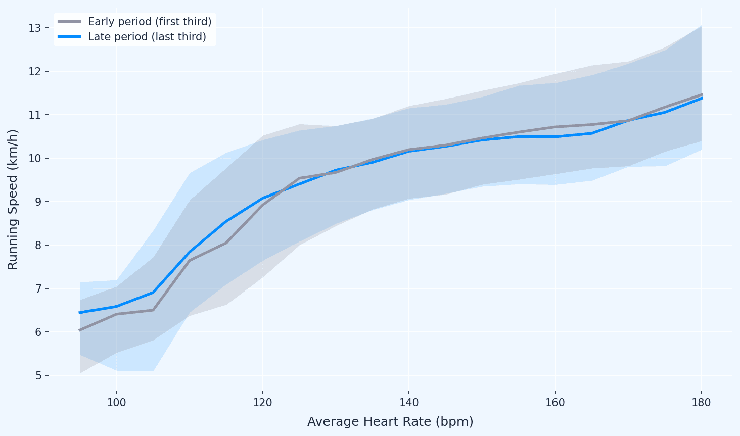
Figure 1: Population speed-HR curves, early vs late. At any given heart rate, the average runner is marginally faster in their final third of activities than their first, but the shift is small, and the curves largely overlap.
Get the latest Terra Research reports and insights every week as soon as they're published.
Wearable data can detect aerobic fitness shifts — no lab required
By comparing matched heart rate bins within each runner across time, I can quantify whether someone is running faster at the same cardiac cost. Across 641 users with a median observation window of 3.5 years, the method produces stable, interpretable estimates.
This matters commercially: any product wanting to show users their fitness is changing can do it with speed and heart rate alone.
At population level, average improvement is close to zero — and that's the point
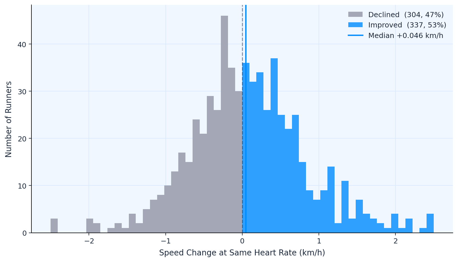
The median speed change at matched heart rates was +0.046 km/h. When I controlled for season, comparing the same calendar quarters year-on-year to remove the effect of summer fitness vs winter detraining, it dropped to +0.002 km/h. Roughly 50% of runners improved, 50% didn't.
This might look like a disappointing result. It's actually the opposite; it's the strongest evidence that the method is measuring something real.
If the speed-HR approach were picking up noise or systematic drift, device calibration shifting over time, seasonal artefacts, measurement error compounding, I'd expect a consistent bias in one direction. Everyone would appear to "improve" or "decline" together. Instead, I see an almost perfect 50/50 split with a median barely distinguishable from zero. That's exactly what a general population of recreational runners should look like. Most people maintain fitness. They don't dramatically gain or lose it.
The validation comes in the next step. When I stratify by training behavior, the groups separate. Dedicated runners improve, Casual runners don't, Intensity-Focused runners trend negative. If this were just noise, slicing by phenotype wouldn't produce different outcomes.
The fact that it does, and in the physiologically expected direction, is what turns a flat average into a credible method.
Figure 2: Distribution of speed change.The distribution of individual speed-HR improvements is wide and centered almost exactly on zero, with roughly half of runners improving and half declining. This near-perfect symmetry is evidence the method is capturing real variation, not systematic noise.
The individual variation is enormous
The interquartile range spans nearly 0.9 km/h (−0.39 to +0.50). Some runners improved by over 2 km/h at the same heart rate; others declined by the same margin. The population average is a poor summary of a dataset this spread. The real question isn't whether improvement happens — it's for whom.
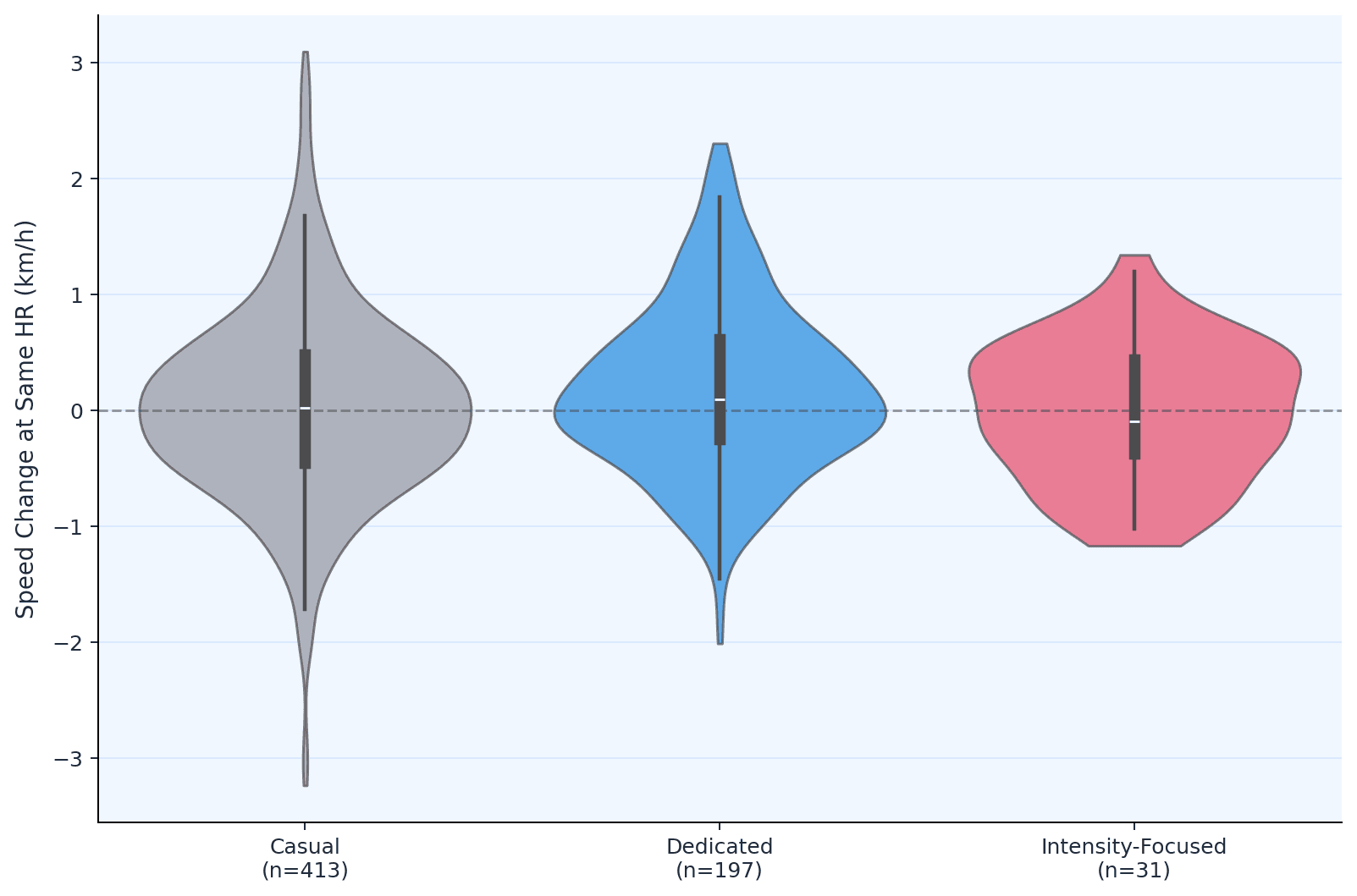
Three distinct training phenotypes emerge from the data
I used k-means clustering on four training dimensions — monthly volume, distance, consistency, and intensity — to identify natural groupings. Three phenotypes emerged:
Casual runners (n=413, 64%): ~4 runs per month, 30 km/month, high month-to-month variability (CV=0.63). The majority of the dataset.
Intensity-Focused runners (n=31, 5%): ~9 runs per month, 63 km/month, but 74% HR reserve and 45% of sessions at high intensity. They push hard.
Dedicated runners are the ones who improve
The Dedicated group showed a median speed-HR improvement of +0.100 km/h, with 56% improving. Significantly better than Casual runners (p=0.006, Mann-Whitney U). Their defining training feature isn't pace or intensity. It's reliability: 12 runs a month at moderate effort with minimal dropout.
To look at this another way, at a given heart rate, Dedicated runners were running 0.1 km/h faster by the end of the observation period than at the start — about 3–4 seconds per kilometer — without their heart working any harder.
Figure 3: Phenotype violin plots. Dedicated runners, consistent, moderate-intensity, high volume, show the clearest positive shift in their speed-HR curve, while Intensity-Focused runners trend negative despite running more than the Casual group.
Intensity without volume trends negative
The Intensity-Focused group — who run at 74% HR reserve with nearly half their sessions at high intensity — showed a median decline of −0.090 km/h. There are two caveats. First, this is a small group (n=31), so I should hold the findings lightly. Second, I haven't formally controlled for volume in the phenotype comparison — the Intensity-Focused group differs from Dedicated runners on both intensity and total mileage simultaneously, so I can't cleanly isolate which factor drives the decline.
That said, there's a natural experiment embedded in the data that's worth noting. The Intensity-Focused group runs considerably more than the average Casual runner — 63 km per month versus 30 km — yet their speed-HR curve moves in the wrong direction. When I compared them to Casual runners running the same mileage, those low-intensity runners at equivalent volume improved by a median of +0.070 km/h; the Intensity-Focused group declined by −0.090 km/h. The direction is suggestive: it's not simply that they don't run enough. In the continuous variable analysis across all 641 users, high-intensity fraction showed a negative coefficient after controlling for volume, though the sample is too small for statistical confidence.
This aligns with what I found in my earlier marathon research, where athletes training with excessive time at threshold pace tended to run slower on race day, not faster. Two different methods, same direction. It's also coherent with established exercise physiology: high-intensity work improves anaerobic capacity and race-specific speed, but shifting the aerobic efficiency curve appears to require volume.
There is clearly a lot going on here, both with the physiology and other factors. I think it's a safe assumption that the high-intensity-focused runners are at the greatest injury risk, which would have a significant impact on the analysis.
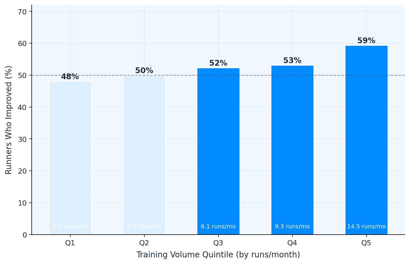
There's a clear dose-response for volume
I split the 641 runners into five equal groups by monthly run frequency. The bottom quintile (2.3 runs/month) saw 47% improve. The top quintile (14.5 runs/month) saw 64% improve — a 17-percentage-point gap. The relationship is roughly linear across quintiles and statistically significant (r=0.097, p=0.014).
Figure 4: Volume quintile bars. Runners in the highest training volume quintile (14.5 runs per month) are 17 percentage points more likely to improve than those in the lowest (2.3 runs per month). The dose-response is roughly linear: each step up in volume shifts the odds measurably in your favor.
Controlling for baseline fitness makes the training signal stronger, not weaker
Better runners have less room to improve — this is a well-known ceiling effect, and I needed to check whether it was confounding the phenotype comparison. Dedicated runners do start faster at baseline (10.7 km/h, around 5:36 per kilometer) compared to Casual runners (9.7 km/h, 6:09 per kilometer). The ceiling effect is real: baseline speed correlates negatively with improvement (r=−0.30, p<0.0001), meaning faster runners as a group improve less, as expected.
But Dedicated runners improve more despite this working against them. When I controlled for baseline speed, the volume and consistency effects didn't disappear — they roughly doubled:
Variable
Raw r
Controlling for baseline
Runs per month
0.090
0.188 (p<0.0001)
km per month
0.080
0.212 (p<0.0001)
Consistency (CV)
−0.093
−0.154 (p<0.0001)
Intensity fraction
−0.001
0.034 (p=0.39)
The within-quartile comparison confirms this is about training behavior, not pre-existing fitness. Among runners in the same baseline speed band (9.1–10.1 km/h), Dedicated runners improved by a median of +0.230 km/h while Casual runners improved by just +0.032. In the next quartile up (10.1–11.0 km/h), Dedicated runners stayed positive (+0.046) while Casual runners declined (−0.214). The training behavior signal is present at every fitness level.
Consistency predicts improvement at least as well as volume
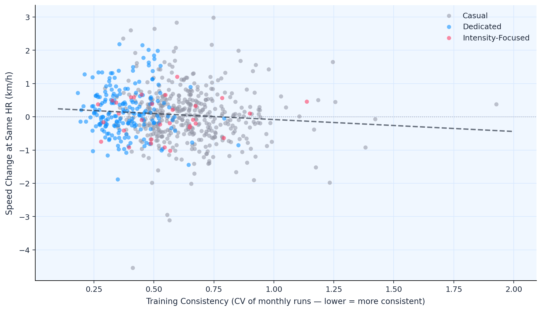
Month-to-month variability in training — measured as the coefficient of variation in monthly run count — was one of the most robust predictors of speed-HR improvement, with a partial correlation of r=−0.154 (p<0.0001) after controlling for baseline fitness. Runners with low variability (CV below 0.4) clustered above zero; those with erratic patterns (CV above 0.7) trended negative.
In plain terms, it's not just how much you run. It's whether you keep showing up. It is the single most durable finding in this analysis.
Figure 5: Consistency scatter.Month-to-month variability in training frequency (lower = more consistent) predicts speed-HR improvement more robustly than any other variable tested.
Intensity alone doesn't predict improvement
Neither before nor after controlling for baseline fitness does high-intensity session fraction predict speed-HR improvement (raw r=−0.001, p=0.98; partial r=0.034, p=0.39). The signal in this dataset is in volume and consistency, not in how hard individual sessions are. This doesn't mean intensity is useless — it almost certainly matters for race-specific fitness and anaerobic capacity — but for shifting the aerobic efficiency curve, the data points elsewhere.
This holds up no matter how you slice the data
I tested five different temporal splits: halves, thirds, quarters, fifths, and tenths. Each compares a progressively narrower early window to a progressively narrower late window.
Split
N users
Median shift
Consistency r (p)
Q5 vs Q1 improved
Halves
641
+0.024
−0.123 (0.002)
63% vs 47%
Thirds
641
+0.042
−0.121 (0.002)
64% vs 47%
Quarters
641
+0.013
−0.108 (0.006)
60% vs 44%
Fifths
638
+0.029
−0.087 (0.027)
56% vs 45%
Tenths
584
+0.014
−0.089 (0.032)
57% vs 47%
Thirds produced the highest signal-to-noise ratio, but the story is identical across all five: consistency predicts improvement in every split. The Dedicated phenotype always improves most. The Q5-vs-Q1 dose-response always holds. As windows narrow, noise increases — fewer runs per window means less stable curve estimates — but the direction never changes.
This is the most methodologically reassuring finding in the analysis. The conclusions aren't an artefact of how I chose to divide the data.
What This Means For Runners, Coaches, and The Wearable Industry
For runners: The data makes a case for the oldest advice in the sport. Don't do anything dramatic. Don't chase every session at threshold. Build a routine you can sustain month after month, and the aerobic system will respond — slowly, quietly, measurably. The Dedicated phenotype's median improvement of +0.100 km/h translates to roughly 3.5 seconds per kilometer. Over a marathon, that's about two and a half minutes. Not from a training camp or a magic session — from simply not stopping.
For the wearable industry: Speed-HR curves derived from consumer devices can detect real physiological adaptation at population scale. The method is crude compared to laboratory testing, but at n=641 with longitudinal data, the signal is there. Spathis et al. (2022) showed that free-living wearable data can predict VO₂max across 11,000 participants with r=0.82 — but required chest-worn accelerometers and deep learning infrastructure. The signal I've found here is less precise but requires only the pace and heart rate data already present on any GPS watch, which makes it far more scalable in practice. I am currently exploring how to incorporate this methodology into a live fitness tracking model, available directly via the Terra dashboard.
For coaches: The consistency finding deserves attention. In a dataset where I tested five independent temporal splits, month-to-month training variability was the only variable that predicted improvement in every single one. Volume mattered, but only robustly in the wider splits. Consistency — the boring, unsexy, "just keep showing up" variable — seems bulletproof.
Limitations of Wearable Heart Rate Data
This is observational data. Fitter people may choose to run more, rather than running more making them fitter. I can't separate cause from effect.
Heart rate data from wrist-based optical sensors has known limitations, particularly at higher intensities where motion artefact increases. I cleaned aggressively, but some noise will remain.
I'm assuming runners perform broadly similar types of runs throughout the observation period. In reality, someone might shift from road to trail, or begin training on hillier routes — both of which would affect the HR-pace relationship independently of any fitness change. With session-level averages, I can't detect this.
"Early" versus "late" periods are defined by each user's own timeline, not a fixed calendar window. The median span is 3.5 years, but individual windows vary from 6 months to over 4 years.
The Intensity-Focused phenotype (n=31) is too small for confident conclusions. The negative trend is suggestive, not definitive.
I measured a proxy for aerobic efficiency only, one dimension of fitness. Speed work, hill strength, race tactics, and mental resilience don't show up in a speed-HR curve. A runner who "declined" by this metric may have improved in ways this method can't capture.
Methodology: Speed-Heart Rate Curves and Exercise Physiology
Our dataset consists of 856,000 running activities. These activities were filtered for valid speed and heart-rate ranges, then narrowed to a longitudinal cohort with sufficient training history for matched speed–heart rate comparisons across early and late training periods.
For the Speed-HR methodology I used heart rate binned in 5 bpm windows. Median speed computed per bin in each period. Speed change = median of (late speed – early speed) across matched bins. Season-controlled replication compared the same calendar quarters across different years.
Phenotyping: K-means clustering (k=3) on standardized features: runs/month, km/month, monthly CV, and, where available, I used median HR reserve fraction and high-intensity session proportion. Clusters validated by silhouette analysis and manual inspection of training profiles.
Lastly, for the robustness: all core findings replicated across five temporal splits (halves through tenths). Thirds selected as primary analysis based on peak signal-to-noise ratio. Cross-split directional agreement ranged from 79% (thirds vs tenths) to 89% (thirds vs quarters).
References
Schimpchen J, Freitas Correia P, Meyer T. Minimally invasive ways to monitor changes in cardiocirculatory fitness in running-based sports: a systematic review. International Journal of Sports Medicine. 2023;44(2):95–107. doi: 10.1055/a-1925-7468
Buchheit M. Monitoring training status with HR measures: do all roads lead to Rome? Frontiers in Physiology. 2014;5:73. doi: 10.3389/fphys.2014.00073
Spathis D, Perez-Pozuelo I, Gonzales TI, Wu Y, Brage S, Wareham N, Mascolo C. Longitudinal cardio-respiratory fitness prediction through wearables in free-living environments. NPJ Digital Medicine. 2022;5:176. doi: 10.1038/s41746-022-00719-1
Methodology
The objective of this research was to determine if longitudinal changes in aerobic fitness could be accurately detected using real-world wearable data and to identify the specific training behaviors that drive those changes.
1. Data Selection and Cohort Definition
The initial dataset comprised 856,000 running activities sourced from the Terra European activity dataset. To ensure a high signal-to-noise ratio, the following filtering criteria were applied:
Longitudinal Consistency: Users were required to have a minimum of 20 recorded runs spanning at least 6 months.
Data Integrity: Sessions required valid GPS-derived speed and optical heart rate (HR) data.
Final Cohort: After filtering for valid heart rate ranges and matched comparison windows, the study focused on a longitudinal cohort of 641 runners with a median observation window of 3.5 years.
Temporal Windows: Fitness change was measured by comparing the first third of a user’s recorded activities (the "Early" period) against their final third (the "Late" period).
2. Measuring Aerobic Fitness (Speed-HR Curves)
Aerobic efficiency was quantified using the relationship between sub-maximal heart rate and running speed. This approach follows established physiological principles: as aerobic fitness improves, a runner can maintain a higher speed at the same cardiac cost.
Binning Process: For each runner, heart rate data was categorized into 5 bpm windows (bins).
Median Speed Calculation: Within each HR bin, the median speed was calculated for both the early and late periods.
Fitness Delta: Speed change was defined as the median of (late speed minus early speed) across all matched bins.
Seasonality Control: To account for weather-related heart rate inflation, a secondary replication was performed on 419 qualifying users, comparing the same calendar quarters year-on-year.
3. Training Phenotype Clustering
To analyze how different behaviors influenced fitness, users were grouped using k-means clustering (k=3) based on four primary training dimensions:
Monthly Volume: Average runs and kilometers per month.
Consistency: Measured as the Coefficient of Variation (CV) of monthly run frequency (where a lower CV indicates more reliable training).
Intensity: Proportion of sessions spent at high intensity (calculated via Heart Rate Reserve fraction).
Baseline Speed: Controlled for the "ceiling effect," acknowledging that faster runners naturally have less room for incremental improvement.
4. Statistical Validation and Robustness
To ensure the conclusions were not an artifact of how the data was divided, the team tested five different temporal splits: halves, thirds, quarters, fifths, and tenths.
Primary Analysis: The "Thirds" split was selected for the final report due to its peak signal-to-noise ratio.
Correlation Analysis: Relationship strengths were tested using raw correlations and partial correlations to isolate the effects of volume and consistency from pre-existing fitness levels.
Significance Testing: Differences between training phenotypes were validated using the Mann-Whitney U test.
Show moreShow less
Summary questions
Do most runners actually get faster over time?
No. Across 641 runners with a median observation window of 3.5 years, the median speed-HR improvement was just +0.046 km/h, dropping to +0.002 km/h after controlling for season. Roughly 50% of runners improved and 50% didn't — improvement is real, but it's far from automatic.
Why am I not getting faster despite running hard sessions?
High-intensity work alone doesn't shift the aerobic efficiency curve. The Intensity-Focused phenotype (n=31) — running at 74% HR reserve with 45% of sessions at high intensity — actually declined by a median of −0.090 km/h, even though they ran more than Casual runners (63 vs 30 km/month). Across all 641 users, high-intensity session fraction had essentially zero correlation with improvement (r=−0.001).
What matters more for getting faster: volume or consistency?
Both matter, but consistency was the most durable predictor across every analysis. Month-to-month variability in run frequency had a partial correlation of r=−0.154 (p<0.0001) with improvement after controlling for baseline fitness, and it predicted improvement in all five temporal splits tested. Volume helps too — the top quintile (14.5 runs/month) saw 64% of runners improve vs 47% in the bottom quintile (2.3 runs/month) — but consistency was bulletproof.
How much faster can I realistically expect to get from consistent training?
The Dedicated phenotype — runners doing about 12 sessions and 120 km per month with low variability — improved by a median of +0.100 km/h at the same heart rate. That's roughly 3.5 seconds per kilometer, or about two and a half minutes over a marathon. The gain is small per kilometer but compounds meaningfully over distance.
Can wearable data really detect fitness changes without a lab test?
Yes. Using only session-average speed and heart rate from consumer GPS watches, the speed-HR curve method produced stable, interpretable estimates across 641 runners and replicated across five different temporal splits (halves through tenths). It's less precise than chest-strap deep learning approaches like Spathis et al. (r=0.82 for VO₂max), but it works with data already on every running watch.
Does running more just mean fitter people self-select into higher volumes?
That's a real concern, but the data argues against it being the whole story. Faster runners actually have less room to improve (baseline speed correlates negatively with gains at r=−0.30), yet within the same baseline speed band of 9.1–10.1 km/h, Dedicated runners improved by +0.230 km/h while Casual runners gained only +0.032. Controlling for baseline fitness roughly doubled the volume and consistency effects rather than erasing them.
Why is a near-zero average improvement actually a good result?
Because it shows the method is measuring real physiology, not drift or noise. If device calibration, seasonal artefacts, or measurement error were dominating, you'd expect everyone to trend the same direction. Instead, the distribution sits almost perfectly symmetrical around zero with an interquartile range of nearly 0.9 km/h — exactly what a general recreational population should look like, and the groups separate predictably when stratified by training behavior.
What's the single most important takeaway for how I should train?
Show up consistently at moderate effort and let volume accumulate. Dedicated runners — 12 runs/month, 120 km/month, low month-to-month variability — were the only group with a clearly positive shift, while runners chasing intensity without volume trended negative. The data backs the oldest advice in the sport: don't do anything dramatic, just don't stop.