We use cookies to enhance your browsing experience and analyse our traffic. By clicking “Accept All”, you consent to our use of cookies according to our Cookie Policy. You can change your mind any time by visiting out cookie policy.
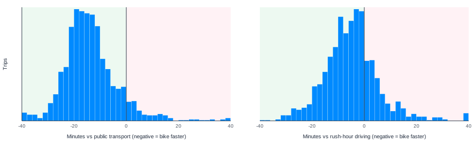
The bike beat TfL on 92% of matched trips. Median saving was 15 minutes door to door, and it beat Google rush-hour driving on 75% of the same journeys, saving a median 5 minutes.
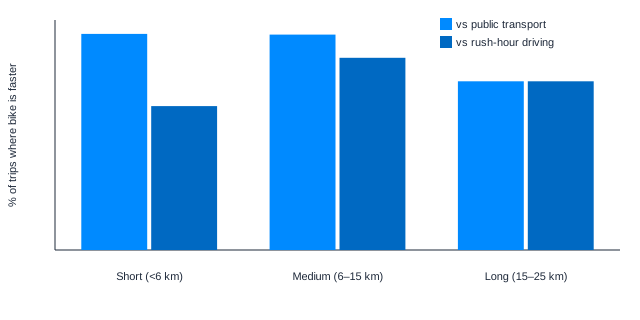
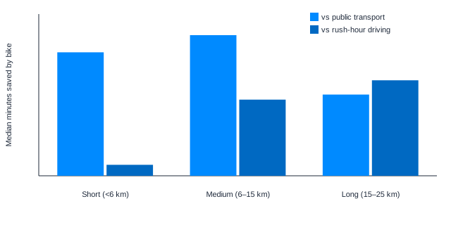
Mid-length rides are the sweet spot, not long ones. On 6 to 15 km commutes the bike won 94% of trips versus the Tube and 84% versus traffic, saving around 9 minutes. On rides over 15 km the Tube becomes competitive again.
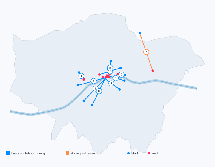
The car only wins in a few specific places. Short hops under 6 km are close to a tie against traffic, and Ilford to Barking was the one busy corridor where driving was faster, by 11 minutes.
Key point: on 1,628 fully matched trips, the bike beats TfL on 92% of journeys (median save 15 minutes) and beats Google rush-hour driving on 75% (median save 5 minutes).
Is cycling actually faster than the Tube for a London morning commute, or just more virtuous? Personally, I love commuting by bike, and I am not afraid to admit I’m a big fan of E-Bikes. I’d choose to use a bike even if it was slightly slower, to get some fresh air, see the sights, and move a little.
For this analysis, I matched 2,168 weekday wearable bike trips starting between 7–9 am against TfL journey times and Google traffic-aware driving for the same origin–destination pairs. The aim? To determine the within-trip deltas, or how many minutes the recorded bike ride wins or loses versus each counterfactual.
Where the Bike Wins
Figure 1: Trip-level time difference for the same morning origin–destination: bike duration minus the modeled alternative. Negative minutes mean the recorded bike ride was faster; green shading marks bike wins.
Most trips sit clearly left of zero versus public transport. Versus traffic, the distribution is tighter and closer to zero but still mostly green. There are more near-ties and losses on short hops where the car is competitive.
Get the latest Terra Research reports and insights every week as soon as they're published.
I split matched trips into short (<6 km), medium (6–15 km), and long (15–25 km) bands. Win rates and median savings both stay with the bike, but the opponent changes with distance. I’m surprised by these results, as I suspected the bike's advantage to be removed over the longer distances.
But this dataset is probably populated by quite serious commuters who aren’t opposed to commuting long distances. We also can’t discount the possibility that more people commute longer distances when there are travel problems with the other options, eg tube strikes.
Figure 2: Share of matched morning trips where the recorded bike ride beats TfL door-to-door or Google traffic driving. Short <6 km, medium 6–15 km, long 15–25 km, win rates stay high across lengths, with traffic wins peaking mid-distance.Figure 3: Median minutes saved on the same origin–destination when cycling versus TfL or Google rush-hour driving. This is a within-trip delta, not a comparison of different absolute journey lengths across modes.
Short rides have a big win over the Tube but only narrowly beat (or sometimes lose to) a car in traffic. Medium rides are the sweet spot: still ~94% wins versus TfL, and traffic wins jump to 84% with about 9 minutes saved. For longer commutes, the Tube becomes a more competitive option, while the bike’s median save versus rush-hour driving stays large.
Wins on Busy Corridors
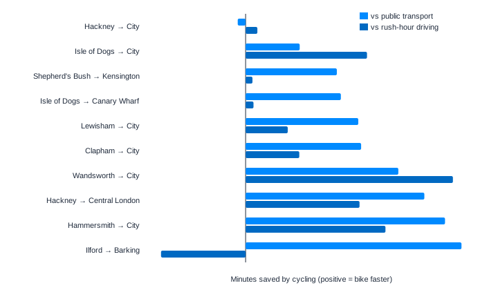
The ten most frequent multi-user corridors are mostly radial rides into the City, Canary Wharf, and central London. On these routes, cycling typically saves about 15 minutes versus TfL and about 8 minutes versus Google rush-hour driving.
Figure 4: Busiest multi-user morning bike corridors over a Greater London silhouette with the Thames. Blue routes beat Google rush-hour driving; orange means traffic still wins.Figure 5: Each corridor has two bars: minutes saved versus public transport and versus Google rush-hour driving. Positive values mean the bike is faster; Ilford → Barking is the main case where Google driving still wins on time.
Corridor
Bike
vs PT
vs Google drive
Shepherd's Bush → Kensington
13 min
−12 min
−1 min
Isle of Dogs → Canary Wharf
10 min
−12 min
−1 min
Lewisham → City
26 min
−14 min
−5 min
Hammersmith → City
31 min
−25 min
−18 min
Hackney → City
24 min
+1 min
−1 min
Wandsworth → City
31 min
−19 min
−26 min
Clapham → City
37 min
−15 min
−7 min
Isle of Dogs → City
24 min
−7 min
−15 min
Hackney → Central London
21 min
−23 min
−14 min
Ilford → Barking
47 min
−27 min
+11 min
Negative minutes mean the bike is faster. Hammersmith → City and Wandsworth → City are standouts against traffic. Hackney → City remains the rare Tube-competitive corridor. Ilford → Barking is the exception versus Google driving, longer outer-London trips are where the car still wins on time.
Methodology
I used a database of outdoor cycling activities on Weekdays in Greater London with local starts from 07:00–08:59, distances of 1–25 km, and durations of 5–90 minutes. That leaves a commute-like cohort.
For each trip I estimated counterfactual travel times:
Public transport:TfL Journey Planner API with door-to-door walking using the same hour/minute on the nearest matching weekday.
Driving (rush hour):Google Routes API for the next matching weekday at the same departure time.
Important caveat: I only see the recorded bike activity. Wearables don’t tell me whether that ride is the full door-to-door commute. Someone may walk to a bike share, cycle part of the way, then take the Tube, or start/stop the activity mid-journey, so the bike times can miss walking legs or other modes at either end.
I think this sample is predominantly “serious” cyclists, so most journeys are probably door-to-door. But I am guessing on that point. By contrast, the TfL and Google estimates are built as full origin–destination journeys. Treat the comparison as bike segment vs door-to-door alternatives, not a perfect like-for-like door-to-door race.
Takeaway
On matched morning origin–destinations, the bike wins most of the time, ~92% versus TfL and ~75% versus Google traffic. With the biggest traffic advantage on medium-length radial rides. Short trips still thrash the Tube/public transport but are closer versus the car; long trips keep solid win rates with larger median savings against traffic. Get on your bike!
Summary questions
Is cycling actually faster than the Tube for a London morning commute?
Yes, and it's not close. Across 1,628 matched weekday morning trips starting between 7–9 am, the bike beat TfL door-to-door journeys on 92% of trips with a median saving of 15 minutes. Public transport was only competitive on a handful of corridors like Hackney → City.
Does cycling beat driving in London rush hour too?
Most of the time, yes. The bike beat Google's traffic-aware driving estimates on 75% of matched trips, with a median saving of 5 minutes. The gap narrows compared to the Tube comparison, but the bike still wins three out of four journeys.
At what distance does cycling have the biggest advantage?
Medium-length rides of 6–15 km are the sweet spot. In this band, the bike won ~94% of matchups versus TfL and jumped to 84% wins versus rush-hour driving, saving around 9 minutes per trip against traffic. Short hops under 6 km crush the Tube but are closer against cars; long rides of 15–25 km keep large median savings against traffic.
Which London corridors show the biggest cycling time savings?
Radial routes into the City and central London dominate. Hammersmith → City saved 25 minutes versus TfL and 18 minutes versus driving, while Wandsworth → City saved 19 minutes versus TfL and a striking 26 minutes versus traffic. On the ten busiest multi-user corridors, cycling typically saved about 15 minutes versus TfL and 8 minutes versus driving.
Are there any routes where cycling loses?
Yes — Ilford → Barking is the notable exception, where Google rush-hour driving beat the bike by about 11 minutes. Longer outer-London trips are where cars retain their time advantage. Hackney → City is also the rare corridor where the Tube stays competitive, essentially tying the bike.
How were the bike times compared against Tube and driving times?
For each of 2,168 weekday wearable bike activities (1–25 km, 5–90 minutes, starting 07:00–08:59), counterfactual travel times were pulled from the TfL Journey Planner API for door-to-door public transport and the Google Routes API for traffic-aware driving at the same departure time on the nearest matching weekday. The analysis then computed within-trip deltas — bike duration minus the modeled alternative — for the same origin–destination pair.
Can wearable cycling data really be compared to door-to-door journey times?
With one important caveat. Wearables only capture the recorded bike segment, so a rider walking to a bike share or combining cycling with the Tube would produce a bike time that misses walking or transfer legs. The TfL and Google estimates, by contrast, are built as full door-to-door journeys, so the fair reading is bike segment vs door-to-door alternatives — though the cohort appears to skew toward serious cyclists doing full commutes.
Why am I not saving much time cycling on my short commute?
Because short trips are exactly where cars stay competitive. Under 6 km, the bike thrashes the Tube but only narrowly beats — and sometimes loses to — traffic-aware driving. If you're already on a short hop, the time advantage of the bike shows up much more strongly against public transport than against a car.