


Mobile App Basics: iOS Swift UI (Part 3)
So far we have explored basic components of an iOS app using Swift UI. Here we will discuss a bit more on some built in views specifically:
- Building a customised pop up screens
- Deep linking back to your app
Customisable pop-up screens
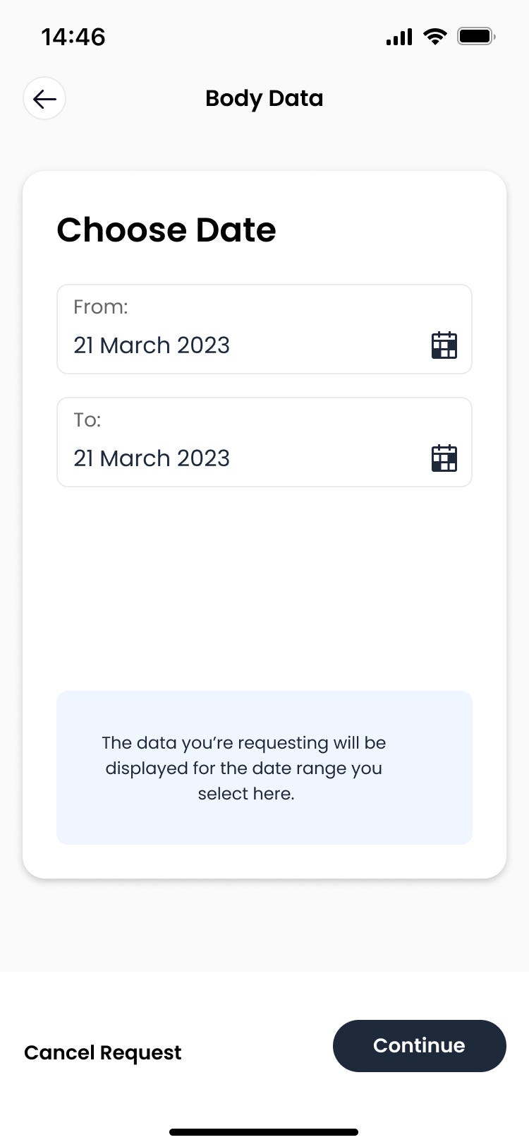
For this, let's say we wish to create a customisable DatePicker for our app. There are many ways to do this, but an elegant way would be to create a custom pop-up. For example:
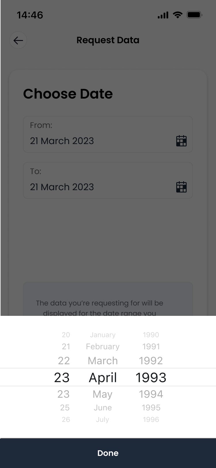
This way you get your user focused on the date picker. First let's the background screen. Following knowledge previously used in Part 1 and 2, this can be done quite easily:
struct DataRequestView : View {
var body: some View {
GeometryReader{ geometry in
VStack{
ZStack{
HStack{
BackButton(path: $path).padding(.leading, 10)
Spacer()
}
Text("Request Data").font(Font.custom("Poppins-Bold", size: 16))
}.padding(.top, 10)
.frame(width: geometry.size.width, height: 24, alignment: .center)
ZStack{
Rectangle()
.fill(Color.white)
.cornerRadius(16)
.shadow(color: Color.blockShadow, radius:6, x: 0, y: 2)
VStack(spacing: 30){
HStack{
Text("Choose Date")
.font(Font.custom("Poppins-Bold", size: 24))
.padding([.leading, .top], 24)
Spacer()
}
ZStack{
Rectangle()
.stroke(Color.init(.sRGB, red: 0.92, green: 0.92, blue: 0.92, opacity: 1), lineWidth: 1)
.cornerRadius(8)
VStack{
HStack{
Text("From: ").font(Font.custom("Poppins-Regular", size: 14)).padding(.leading, 12)
Spacer()
}.padding(.top, 8)
HStack{
Text(ISO8601DateFormatter.string(from: Date(), timeZone: TimeZone.current, formatOptions: [.withDay, .withYear, .withMonth, .withDashSeparatorInDate])).font(Font.custom("Poppins-Regular", size: 16)).padding(.leading, 12)
Spacer()
Image("calendar").frame(width: 18, height: 19.5).padding(.trailing, 12)
.onTapGesture {
// Show
}
}.padding([.bottom, .top], 8)
}.frame(alignment: .center)
}.frame(width: geometry.size.width * 0.8, height: 50, alignment: .center).padding(.top, 20)
ZStack{
Rectangle()
.stroke(Color.init(.sRGB, red: 0.92, green: 0.92, blue: 0.92, opacity: 1), lineWidth: 1)
.cornerRadius(8)
VStack{
HStack{
Text("To: ").font(Font.custom("Poppins-Regular", size: 14)).padding(.leading, 12)
Spacer()
}
.padding(.top, 8)
HStack{
Text(ISO8601DateFormatter.string(from: Date(), timeZone: TimeZone.current, formatOptions: [.withDay, .withYear, .withMonth, .withDashSeparatorInDate])).font(Font.custom("Poppins-Regular", size: 16)).padding(.leading, 12)
Spacer()
Image("calendar").frame(width: 18, height: 19.5).padding(.trailing, 12)
.onTapGesture {
// Show date picker view
}
}.padding([.bottom, .top], 8)
}.frame(alignment: .center)
}.frame(width: geometry.size.width * 0.8, height: 50, alignment: .center).padding(.top, 16)
Spacer()
Text("The data you're requesting will be displayed for the date range you select here.")
.font(Font.custom("Poppins-Regular", size: 14))
.multilineTextAlignment(.center)
.frame(width: geometry.size.width * 0.7, height: 109, alignment: .center)
.background(
Rectangle()
.fill(Color.init(.sRGB, red: 240/255, green: 246/255, blue:255/255, opacity: 1))
.cornerRadius(8)
.frame(width: geometry.size.width * 0.8, height: 109, alignment: .center)
).padding(.bottom, 20)
}.frame(alignment: .center)
}.padding(.top, 40)
.frame(width: geometry.size.width*9/10, height: 500, alignment: .center)
Spacer()
ZStack{
Rectangle()
.fill(Color.white)
.ignoresSafeArea(.all)
.frame(height: 120)
HStack{
Text("Cancel Request")
.font(Font.custom("Poppins-SemiBold", size: 14))
.padding(.leading, 16)
.onTapGesture {
// Go back
}
Spacer()
Button(action: {
// Continue
}, label: {
Text("Continue")
.font(Font.custom("Poppins-SemiBold", size: 14))
.foregroundColor(Color.white)
.background(
Rectangle()
.fill(Color.darkBackground)
.cornerRadius(22)
.frame(width: 122, height: 37)
)
}).padding(.trailing, 40)
}
}.frame(width: geometry.size.width, alignment: .center)
}.frame(width: geometry.size.width, height: geometry.size.height, alignment: .center)
}.navigationBarBackButtonHidden(true)
.background(Color.appBackground, ignoresSafeAreaEdges: .all)
}
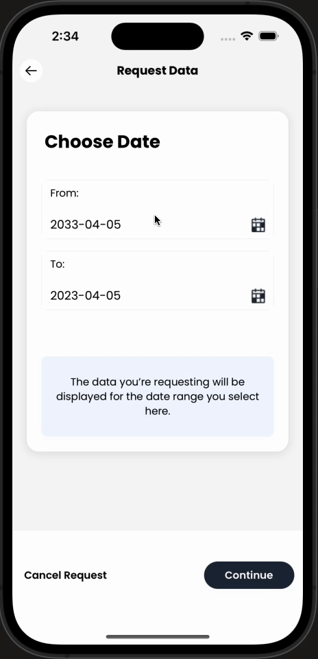
}In this flow, we want to display the DatePicker when the user presses the little calendar icon. Hence, we want a onTapGesture property on our Calendar image.
We can use the trick we did in Part 2: introduce a State variable to say when to show the DatePicker:
struct DataRequestView : View {
    @State var showDatePicker: Bool = false
    var body: some View {
        ...
                        ZStack{
                            Rectangle()
                                .stroke(Color.init(.sRGB, red: 0.92, green: 0.92, blue: 0.92, opacity: 1), lineWidth: 1)
                                .cornerRadius(8)
                            VStack{
                                HStack{
                                    Text("From: ").font(Font.custom("Poppins-Regular", size: 14)).padding(.leading, 12)
                                    Spacer()
                                }.padding(.top, 8)
                                HStack{
                                    Text(ISO8601DateFormatter.string(from: Date(), timeZone: TimeZone.current, formatOptions: [.withDay, .withYear, .withMonth, .withDashSeparatorInDate])).font(Font.custom("Poppins-Regular", size: 16)).padding(.leading, 12)
                                    Spacer()
                                    Image("calendar").frame(width: 18, height: 19.5).padding(.trailing, 12)
                                        .onTapGesture {
                                            showDatePicker.toggle()
                                        }
                                }.padding([.bottom, .top], 8)
                            }.frame(alignment: .center)
                        }.frame(width: geometry.size.width * 0.8, height: 50, alignment: .center).padding(.top, 20)
          ...
        .background(Color.appBackground, ignoresSafeAreaEdges: .all)
    }
}
We can then create a new View that takes in a Binding variable. This view will what the user sees when they tap on the calendar icon:
struct DatePickerView: View{
    @Binding var showPicker: Bool

    var body: some View{
          VStack{

          }
      }
}
We can now use the sheets in SwiftUI to display the DatePicker as a popup. In our DataRequestView:
struct DataRequestView : View {
    @State var showDatePicker: Bool = false
    var body: some View {
        GeometryReader{geometry in
         ...
        }.navigationBarBackButtonHidden(true)
        .background(Color.appBackground, ignoresSafeAreaEdges: .all)
        .sheet(isPresented: $showStartDatePicker, content: {
            DatePickerView(showPicker: $showDatePicker)
        })
    }
}
This will display DatePickerView whenever the calendar icon is tapped on as a sheet laying over the current DataRequestView .
The problem here is that the sheet has a completely white background.... but we want a clear one. To combat that, we need to create a custom background that is simply a "clear" colour background:
struct RemoveBackgroundColor: UIViewRepresentable{
    func makeUIView(context: Context) -> UIView{
        return UIView()
    }

    func updateUIView(_ uiView: UIView, context: Context) {
        DispatchQueue.main.async {
            uiView.superview?.superview?.backgroundColor = .clear
        }
    }
}
This is simply a UIViewRepresentable class that can be used as a background in the .background modifier:
struct DataRequestView : View {
    @State var showDatePicker: Bool = false
    var body: some View {
        GeometryReader{geometry in
         ...
        }.navigationBarBackButtonHidden(true)
        .background(Color.appBackground, ignoresSafeAreaEdges: .all)
        .sheet(isPresented: $showStartDatePicker, content: {
            DatePickerView(showPicker: $showDatePicker)
              .background(RemoveBackgroundColor())
        })
    }
}
Finally, the only thing we need to build out is the DatePickerView. For this, we can use the DatePicker view from Swift UI:
struct DatePickerView: View{
    @Binding var showPicker: Bool
    @State var shownDate: Date = Date()

    var body: some View{
        GeometryReader{ geometry in
            VStack(spacing: 0){
                Spacer()
                DatePicker("", selection: $shownDate, displayedComponents: [.date]).datePickerStyle(.wheel)
                    .labelsHidden()
                    .frame(width: geometry.size.width ,height: 212, alignment: .center)
                    .background(Color.white)
                ZStack{
                    Rectangle()
                        .fill(Color.black)
                    VStack{
                        Text("Done")
                            .font(Font.custom("Poppins-SemiBold", size: 14))
                            .foregroundColor(Color.white)
                            .padding(.top, 12)
                        Spacer()
                    }
                }.frame(width: geometry.size.width, height: 60)
                .onTapGesture {
                    showPicker.toggle()
                }
            }
        }.ignoresSafeArea(.all)
    }
}
This requires a state variable that is a Date object to be passed in to the view to get the date returned from the picker. We also simply toggle showPicker which is binded to the state variabled passed into this view to stop displaying it.
Putting this together will look like this:
Deeplinking
Another method to improve user experience is automatically linking the user back to your app when they perhaps has been redirected somewhere else to complete an action (for example logging into another app).
The way to do this is by deep linking! To set this up, it is rather simple...
You will need to add a URL Type to your project: Under your app target, go to Info (where your Info.plist is displayed). At the bottom, there is a tab called URL Types:
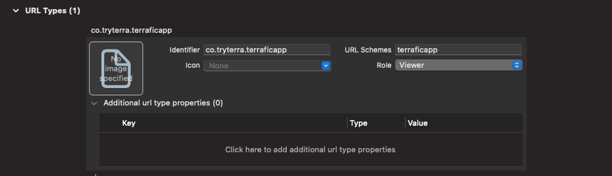
Add a URL Type as shown above. The identifier is your app's identifier, typically will be the reverse of your domain (tryterra.co) and some name you assign to your app (co.tryterra.terraficapp). The URL Schemes is what allows the phone to know where to direct the user to. This will essentially replace the https in the URLs you are familiar with.
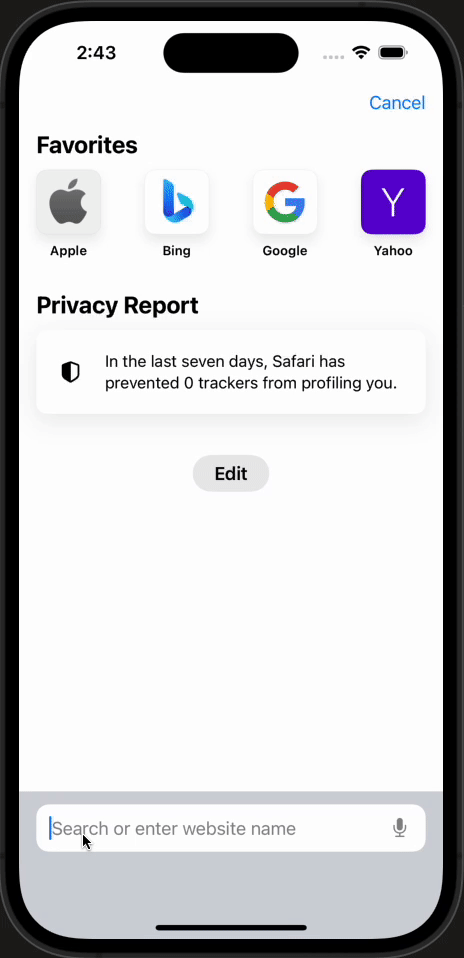
Simply having this setting, if you go into your phone's safari and type in terraficapp:// in the link tab, it will prompt you to be redirected to the app!
Finally, in order to catch this URL and perform actions according to it, there is a modifier that you can add to views:
ContentView()
    .onOpenURL { url in
        // Do something according to URL
    }
Build it out
There are so many things SwiftUI has to offer. So far we have only touched the basics.
The best way to master all of this is to go and build out an app for yourself!


