


Mobile App Basics: iOS Swift UI (Part 2)
In the previous article, we explored basic styling and view building in Swift UI for a mobile app which includes:
- Importing your own images
- Using your own fonts
- Using primitive views (Rectangle, Circle, Text, Button)
Knowing all of this, we can now go ahead and learn how to direct the app user to different Views or functionalities. In this article, we will cover some other topics including:
- Navigating the app to different views
- Changing a view's state dynamically
The Main View
For the purposes of our demonstration app, we can let the app user select their path at the ContentView View. For now, we have created our own view called WidgetInfo, and we can link the user to this View with a button click fromContentView.
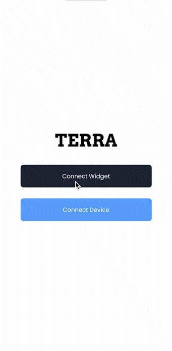
For the design, let's go with this in the ContentView :
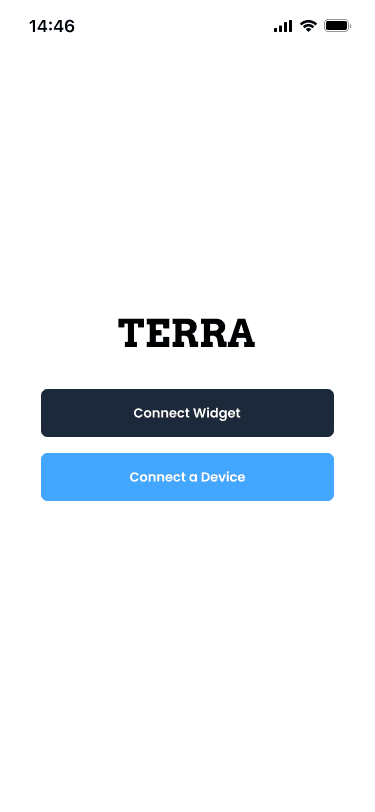
On the trigger for Connect Widget button, we will want to link them to WidgetInfo.
The design for this is simple. We will simply be re-using the knowledge we know from Part 1:
struct ContentView: View {
    var body: some View {
        VStack {
            Image("TERRA")
                .imageScale(.large)
                .foregroundColor(.accentColor)
                .padding([.bottom], 32)

            Button {
                // link to Widget Info Page
            } label: {
                Text("Connect Widget")
                    .foregroundColor(Color.white)
                    .font(Font.custom("Poppins-Regular", size: 13))
                    .frame(width: 290, height: 50)
            }.background(
                Rectangle()
                    .fill(Color.darkBackground)
                    .cornerRadius(6.5)
            )

            Button {
                // Go to Connect device page
            } label: {
                Text("Connect Device")
                    .foregroundColor(Color.white)
                    .font(Font.custom("Poppins-Regular", size: 13))
                    .frame(width: 290, height: 50)
            }.background(
                Rectangle()
                    .fill(Color.lightBackground)
                    .cornerRadius(6.5)
            ).padding([.top], 16)

        }
        .padding()
    }
}
Navigation Stack
The question now is, how do we link the user to WidgetInfo when the button is pressed in our View?
We can actually do this with what SwiftUI calls a NavigationStack (or NavigationView ). To do this, we simply need to wrap our entire View in a navigation stack:
struct ContentView: View {
    var body: some View {
        NavigationStack{
            VStack {
                Image("TERRA")
                    .imageScale(.large)
                    .foregroundColor(.accentColor)
                    .padding([.bottom], 32)

                Button {
                // link to Widget Info Page
                } label: {
                    Text("Connect Widget")
                        .foregroundColor(Color.white)
                        .font(Font.custom("Poppins-Regular", size: 13))
                        .frame(width: 290, height: 50)
                }.background(
                    Rectangle()
                        .fill(Color.darkBackground)
                        .cornerRadius(6.5)
                )

                Button {
                    // Go to Connect device page
                } label: {
                    Text("Connect Device")
                        .foregroundColor(Color.white)
                        .font(Font.custom("Poppins-Regular", size: 13))
                        .frame(width: 290, height: 50)
                }.background(
                    Rectangle()
                        .fill(Color.lightBackground)
                        .cornerRadius(6.5)
                ).padding([.top], 16)

            }
            .padding()
        }
    }
}
The next thing we would need to use is a NavigationLink. Lucky for us the views Button and NavigationLink contains similar arguments, and in our case, we can actually just replace Button with NavigationLink. The only thing else we would need to add would be to call our WidgetInfo view when the link is triggered:
struct ContentView: View {
var body: some View {
NavigationStack{
VStack {
Image("TERRA")
.imageScale(.large)
.foregroundColor(.accentColor)
.padding([.bottom], 32)
NavigationLink {
WidgetInfo()
} label: {
Text("Connect Widget")
.foregroundColor(Color.white)
.font(Font.custom("Poppins-Regular", size: 13))
.frame(width: 290, height: 50)
}.background(
Rectangle()
.fill(Color.darkBackground)
.cornerRadius(6.5)
)
NavigationLink {
// Go to Connect BLE
} label: {
Text("Connect Device")
.foregroundColor(Color.white)
.font(Font.custom("Poppins-Regular", size: 13))
.frame(width: 290, height: 50)
}.background(
Rectangle()
.fill(Color.lightBackground)
.cornerRadius(6.5)
).padding([.top], 16)
}
.padding()
}
}
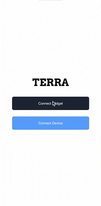
}Let's see it in action:
The back button is actually automatically added because of NavigationLink.
State Variables
Personally, the back button shown from the navigation stack is not the best in terms of style. Let's create our own:
struct BackButton: View{
    var body: some View{
        ZStack{
            Circle().fill(Color.white)
            Image(systemName: "arrow.backward").foregroundColor(Color.black)
        }.frame(width: 31, height: 31, alignment: .center)
    }
}
The downside of doing so is that we will need to implement our own logic when we want to go back to the ContentView page.
Luckily, we can make use of a very cool feature of Swift UI: State and Binding variables.
Essentially, you propagate changes from one view to another and dynamically cause changes to views using these.
For our back button, we can introduce a Binding variable which we will pass into from the ContentView as a State variable. We simply want this variable to be a Bool for now that we toggle whenever the user touches this back button. For this we will use onTapGesture():
struct BackButton: View{
    @Binding var toggle: Bool

    var body: some View{
        ZStack{
            Circle().fill(Color.white)
            Image(systemName: "arrow.backward").foregroundColor(Color.black)
        }.frame(width: 31, height: 31, alignment: .center)
            .onTapGesture {
                toggle.toggle()
            }
    }
}
We will use the toggle variable to represent: "Do we want to show this view or not". This variable will be controlled by ContentView so let's create a State variable in ContentView :
struct ContentView: View {

    // The default state here is false (do not show)
    @State var showWidgetInfo: Bool = false

    var body: some View {
        NavigationStack{
...
With this, we can then manipulate the navigation stack to determine when we want to show WidgetInfo or not by toggling showWidgetInfo. For now, we can simply replace the NavigationLink with a Button to toggle this variable when pressed:
struct ContentView: View {

    @State var showWidgetInfo: Bool = false

    var body: some View {
        NavigationStack{
            VStack {
              ...
                Button {
                    showWidgetInfo.toggle()
                } label: {
                    Text("Connect Widget")
                        .foregroundColor(Color.white)
                        .font(Font.custom("Poppins-Regular", size: 13))
                        .frame(width: 290, height: 50)
                }.background(
                    Rectangle()
                        .fill(Color.darkBackground)
                        .cornerRadius(6.5)
                )

              ...

            }
        }
    }
}
Finally, the magic here is, we can add a navigationDestination property to our VStack to tell the app where to go when the value of this state variable is set to true:
struct ContentView: View {

    @State var showWidgetInfo: Bool = false

    var body: some View {
        NavigationStack{
            VStack {
                Image("TERRA")
                    .imageScale(.large)
                    .foregroundColor(.accentColor)
                    .padding([.bottom], 32)

                Button {
                    showWidgetInfo.toggle()
                } label: {
                    Text("Connect Widget")
                        .foregroundColor(Color.white)
                        .font(Font.custom("Poppins-Regular", size: 13))
                        .frame(width: 290, height: 50)
                }.background(
                    Rectangle()
                        .fill(Color.darkBackground)
                        .cornerRadius(6.5)
                )

                NavigationLink {
                    // Go to Connect BLE
                } label: {
                    Text("Connect Device")
                        .foregroundColor(Color.white)
                        .font(Font.custom("Poppins-Regular", size: 13))
                        .frame(width: 290, height: 50)
                }.background(
                    Rectangle()
                        .fill(Color.lightBackground)
                        .cornerRadius(6.5)
                ).padding([.top], 16)

            }
            .navigationDestination(isPresented: $showWidgetInfo){
               // Go to Widget Info View
             }
            .padding()
        }
    }
}
Before we can let it navigate the user to WidgetInfo, we need to create a Binding variable in WidgetInfo View's implementation, this way we can link our custom back button to toggle this State variable:
struct WidgetInfo: View{

    @Binding var showWidgetInfo: Bool
    var body: some View{
    ...
    }
}
We can then pass a Binding reference into WidgetInfo in ContentView as such:
...
.navigationDestination(isPresented: $showWidgetInfo){
    WidgetInfo(showWidgetInfo: $showWidgetInfo)
}
And, in WidgetInfo we will simply pass this variable along to the custom back button view.
Note: Spacer here is a built-in view that simply fills up the entire space in the HStack after the back button. In addition, we can use .navigationBarBackButtonHidden(true) on the entire view to (you guessed it) hide the hideous built-in back button.
struct WidgetInfo: View{

    @Binding var showWidgetInfo: Bool

    var body: some View{
        VStack{
            HStack{
                BackButton(toggle: $showWidgetInfo )
                Spacer()
            }
            Image("widgetInfo")
            Text("Widget to connect your app to all wearables")
                .multilineTextAlignment(.center)
                .font(Font.custom("Poppins-Bold", size: 20))
                .frame(width: 261, height: 60)
                .padding([.top], 64)
            Text("Unlock the power of health data")
                .multilineTextAlignment(.center)
                .font(Font.custom("Poppins-Regular", size: 16))
                .frame(width: 296, height: 21)
                .padding([.top], 16)
            HStack{
                Circle().frame(width: 12, height: 12)
                Circle().fill(Color.lightGray).frame(width: 12, height: 12)
                    .padding([.leading], 4)
                Circle().fill(Color.lightGray).frame(width: 12, height: 12)
                    .padding([.leading], 4)
            }
            .padding([.top], 40)
            Button(action: {
              //
            }, label: {
                Text("Continue")
                    .font(Font.custom("Poppins-Regular", size: 13))
                    .foregroundColor(Color.white)
                    .frame(width: 169, height: 33)
                    .background(
                        Rectangle()
                            .fill(Color.darkBackground)
                            .cornerRadius(6.5)
                    )
                    .padding([.top], 105)
            }).padding()
        }.navigationBarBackButtonHidden(true)
    }
}
Let's take a look:
and More...
State and Binding variables can be used to do a lot more than a toggle. You can also have a state variable that is an Int for which can increase every time a button is pressed for example. These really help create a dynamic field to the app and gives the user a much better experience.
We will explore some more exciting topics such as Deep Linking in your app and play around with other more interesting built-in abilities of SwiftUI!


