We use cookies to enhance your browsing experience and analyse our traffic. By clicking “Accept All”, you consent to our use of cookies according to our Cookie Policy. You can change your mind any time by visiting out cookie policy.
We tracked blood oxygen during sleep across 1,045 nights people spent at altitude. At the same 2,270 m, the most sensitive tenth lost 8.5 percentage points overnight while the most resilient tenth lost nothing.
How high you go explains only 27% of how much your oxygen drops. Each extra kilometer costs about 2.6 points; the other 73% is the individual and their circumstances that trip.
The hardest hit on night one recovered fastest, but nobody responded the same way twice. Those down 5 or more points were back to −2.7 by night five, yet the same person's response only correlated at r = 0.31 across trips.
The last blog I wrote about trips to altitude was about the average trip. It showed what we’d expect to find: when people first travel from a low-altitude location to a high one, we see a lower level of blood oxygen saturation (SpO₂), accompanied by a penalization of recovery metrics, with HRV down and min and resting HR increasing. This is because the lower partial pressure of oxygen in the environment means less oxygen reaches the blood from the lungs, which increases HR and reduces HRV, likely due to systemic strain increasing sympathetic tone.
These average effects are interesting, but not particularly valuable for the individual. At sample level, a statistically significant average effect can hide a continuum of human responses. If you are not the average, that finding may not be very useful for you.
So, this post is about that spread in the same data set (1,045 arrival nights and 551 paired days) in the same cohort (high activity at altitude on day 0 through day 5, each compared to a personal lowland baseline).
Similar caveat as last time. This data was taken from a large dataset and then filtered by users traveling to high-altitude locations after being at a home/low location for a stretch of days. In this anonymised data we can only determine where users are by activity data start location, so we are presuming they are not just going up a mountain to do some exercise and returning lower to sleep.
Check out the last blog for more details of the method.
The distribution of SpO₂ drops
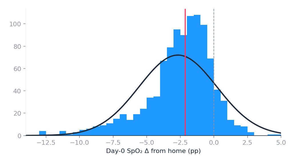
Distributions are a nice way to visualize the sample’s data. Chart 1 below shows the change in arrival-night SpO₂ relative to each person’s own lowland baseline. The frequency peaks near a 2 pp (percentage points) drop, close to what the average story would suggest. But it is not a neat normal curve (skew ≈ −1.9). About 15% of nights drop 5 pp or more, and about 10% sit at or above home.
The long left tail is what you would expect physiologically. SpO₂ has a ceiling near 100% at low elevation, so there is little room for a symmetric “better than home” side. Small positive shifts are more likely noise than super-adaptation. And this is a pooled sample across different trip heights, which also stretches the cloud.
This demonstrates that one average drop is not enough to describe what is going on. The impact of altitude on users SpO2 is skewed.
Chart 1: Distribution of Day-0 SpO₂ Δ vs home.
Get the latest Terra Research reports and insights every week as soon as they're published.
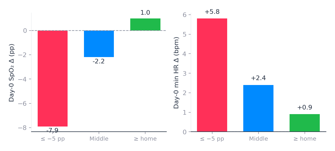
Then I wanted to investigate what is driving the extremes at each end of the distribution. Are they the same kind of night, or is the extreme just due to randomness? Or can we attribute it to a known factor? If you cut at ≤ −5 pp on one side and at or above home on the other, it’s clear they are not random.
The left tail (n = 153) is made up mostly of higher trips: median elevation around ~2,570 m, min HR up by about +5.8 bpm, and 72% hit both SpO₂ and min HR thresholds (SpO₂ already ≤ −5 pp vs home, and min HR ≥ +2 bpm above home). But even after you account for height, they are still about −3.6 pp worse than the elevation line predicts. So it’s a combination of high trips and users who seem particularly susceptible to the altitude.
The right tail (n = 109) looks very different. Median elevation is only around ~1,600 m, autonomic markers barely move, and a lot of these nights are mild trips sitting against a high home SpO₂ ceiling. This nicely confirms that the left tail has been driven by higher altitude trips, real stress, and leftover sensitivity. The right tail is lower trips and a measurement ceiling, probably not a group of super-responders. This again is what we’d expect, but tells us nothing about individual responses.
Chart 2: Mean day-0 SpO₂ and min HR by tail.
First vs last decile
To see how wide the range still is after altitude is removed, I plotted SpO₂ vs Altitude to see how much worse or better they are than the height line predicts. Then I compared the most sensitive tenth to the most resilient tenth. Mean elevation is matched (about 2,270 m for both), so this is not just “some people went higher.”
Metric (day 0)
Decile 1 (most sensitive)
Decile 10 (most resilient)
Gap
SpO₂ Δ
−8.5 pp
+0.3 pp
−8.8 pp
Min HR Δ
+5.0 bpm
+1.0 bpm
+4.0 bpm
Resting HR Δ
+4.1 bpm
+1.4 bpm
+2.7 bpm
HRV RMSSD Δ
−10.7 ms
−5.2 ms
−5.5 ms
63% of the most sensitive nights see both SpO₂ and min-HR thresholds hit, and only 0% of the most resilient nights do (SpO₂ at least 5 pp below that person’s home baseline, and min HR at least about +2–3 bpm above home) That is just an illustrative boundary, not a clinical definition, but it is a useful way to count nights where oxygen and heart-rate stress move together.
So different people’s response to thin air is incredibly different, across all the metrics I looked at. This can be seen as the “spread” of the responses, but it doesn’t tell us about the 80% of people who sit between these ends of the spectrum.
Big hits bounce more
The next question is, we can see some people are impacted harder on night 0 than others. But what does the next five nights look like for them? Do they catch up, or not?
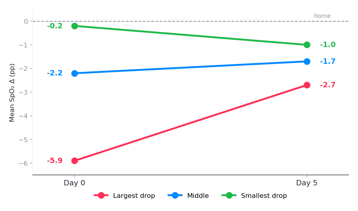
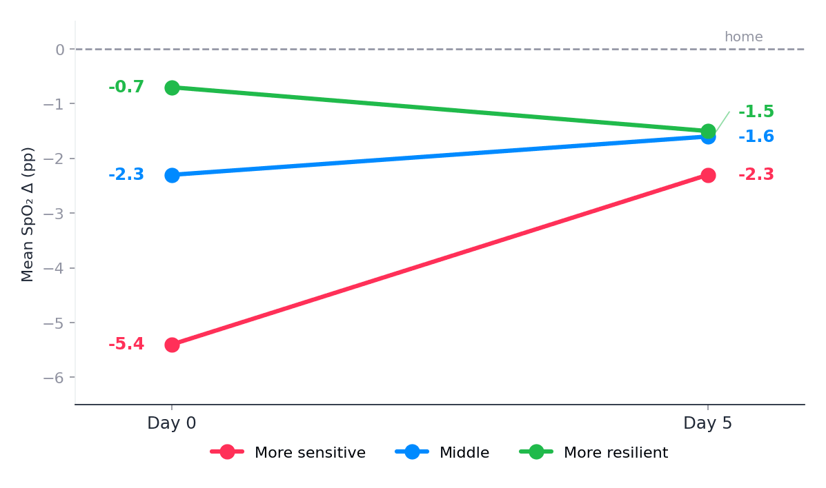
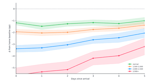
I split the 551 paired trips into thirds by day-0 SpO₂ drop: the largest-drop third moves from about −5.9 → −2.7 pp, the middle from −2.2 → −1.7 pp, and the mildest from −0.2 → −1.0 pp. Among people who arrived with a ≥5 pp drop, 70% are still at least 1 pp below home on night 5.
Chart 3: Day 0→5 SpO₂ by arrival tertile.
Whenever I see a result like this, you have to question if this is just “regression to the mean” and that is certainly playing a role here. Day-0 and day-5 SpO₂ correlate only at about r ≈ 0.31, which explains some of the convergence. But not all of it. About 31% of the day-0 tertile gap is still there on day 5.
One way to read Chart 3 is: the hard-hit sensitive group gains more SpO₂ points from night 0 to night 5 (−5.9 to −2.7 is a bigger bounce than the mild group). But they have more opportunity to do so. They are still further from baseline than the mild group. So ranking within a single trip partly sticks.
This is not asking if the same person will look the same on their next trip. Within-trip stickiness asks: if you were hard-impacted on night 0 of this stay, are you still relatively hard-hit on night 5 of this stay? Cross-trip repeatability asks: if you were hard-hit on trip A, are you hard-hit again on trip B months later? More on that later.
Looking across markers for the same three arrival thirds makes the recovery story clearer, SpO₂ and HRV bounce more than resting HR:
Arrival third (by day-0 SpO₂)
SpO₂ day 0 → 5
Min HR day 0 → 5
Resting HR day 0 → 5
HRV RMSSD day 0 → 5
Largest drop
−5.9 → −2.7 pp
+4.4 → +2.3 bpm
+3.2 → +2.7 bpm
−8.3 → −2.2 ms
Middle
−2.2 → −1.7 pp
+3.0 → +1.9 bpm
+1.6 → +2.4 bpm
−6.5 → −2.9 ms
Mildest
−0.2 → −1.0 pp
+1.3 → +1.0 bpm
+1.6 → +1.6 bpm
−3.4 → −0.8 ms
Resting HR barely moves back toward home, and in the middle third it even drifts a bit worse, while SpO₂ and HRV show clearer bounce. That is the marker-specific recovery point.
Height explains a lot
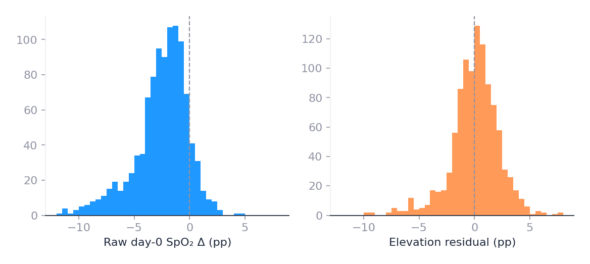
Day-0 SpO₂ falls with elevation at about −2.6 pp per kilometer, with an R² of 0.27. That is a real dose effect, as we would expect. It is also not the whole story: the residual still has an SD of 2.48 pp and remains left-skewed.
Chart 4: Raw vs elevation-residual SpO₂.
If you then look at height-matched residual tertiles (trips around 1800 m- 2000 m), the sensitive third is still around −5.1 pp on arrival versus about −0.7 pp for the resilient third, with roughly +1.8 bpm extra min HR. Through day 5, about 17% of that day-0 gap remains. As a sense check, I looked at daily activity hours, and they add essentially nothing to SpO₂ R² once elevation is already in the model. Once elevation is removed, the individual impact remains.
Chart 5: Height-adjusted residual tertiles, day 0→5. Similar to Chart 3, but with altitude accounted for.
A mixed model approach
To put nights 0 through 5 in one model, I used a linear mixed model of the form Δ ~ day × elev_km + (1|trip). The fixed part (elevation, day, day × elevation) is the shared / population-average dose–response: on average, how does height set the hit, and how does that change across nights? The random intercept (1|trip) is the individualization within each stay: each trip is allowed its own offset above or below that average curve.
That is why the trip ICC matters: it is how much leftover variance is sticky to that stay after the average altitude effect is removed.
It is not a full “personal altitude phenotype” across a person’s whole life. For that you need repeat trips (see below). But it is already more than a plain population mean: every trip gets its own level.
Outcome
Elev (day 0)
Day × elev
Trip ICC
SpO₂
−2.62 pp/km
+0.23 pp/d/km
0.43
HRV RMSSD
−3.35 ms/km
+0.56 ms/d/km
0.51
Min HR
+1.67 bpm/km
−0.15 bpm/d/km
0.37
Resting HR
+1.29 bpm/km
−0.07 (n.s.)
0.48
At 2,000 m, predicted SpO₂ moves from about −3.0 → −1.9; at 2,500 m, from −4.3 → −2.6.
Height sets the SpO₂ centre, and 40%+ of the leftover variance remains within a stay. SpO₂ and HRV look like hit-then-bounce; resting HR is much stickier.
Archetypes or a continuum?
As humans, I think we often want to categorize people into binary types, e.g., “good responders” and “poor responders.” I ran a Gaussian mixture model on the day-0 response (arrival-night deltas/residuals) to see if the data cluster. “k” is just the number of clusters the model is asked to fit.
The model prefers k = 2, but the SpO₂ component means are only about 0.5 SD apart, close enough that the two “clusters” heavily overlap. Multivariate silhouette is around 0.34, and PCA puts roughly 53% of the variance on a single axis.
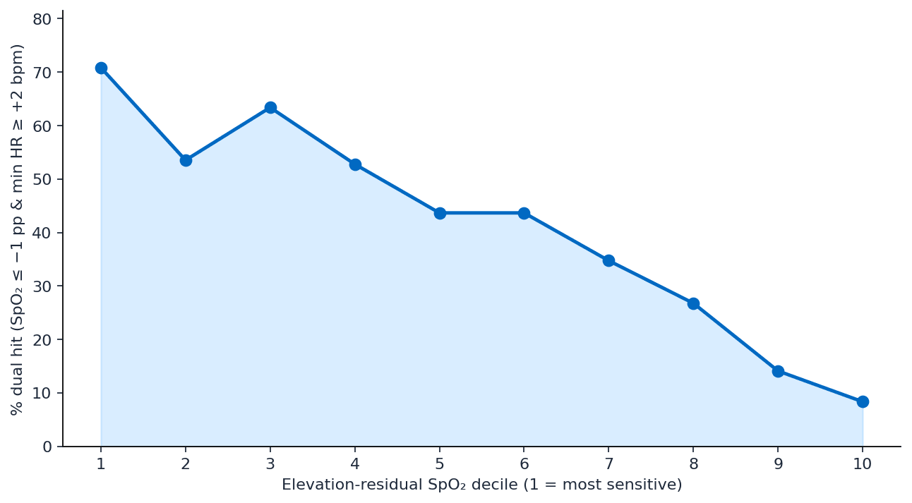
The probability of hitting both SpO₂ and min-HR thresholds (here, the milder dual hit: SpO₂ ≤ −1 pp vs home and min HR ≥ +2 bpm) falls smoothly across residual deciles (R² ≈ 0.78–0.94 depending on the exact cut). That is what Chart 6 shows, and these data do not support categorizing people into buckets of their physiological response to altitude.
Chart 6: Dual-hit rate by elevation-residual SpO₂ decile.
The pattern looks much more like a continuous gradient with a sensitive tail rather than discrete responder types. “Fat-sensitive tail” does not mean most people are more sensitive than expected; it means the left side of the distribution is stretched: a minority are hit much harder than the middle of the pack.
Same person, next trip
As an extra check I decided to investigate users who had multiple trips in the data set. Firstly as a “check,” because you’d imagine someone would respond relatively similarly on different occasions. But secondly, to see if there was an improvement in response. This is the place to be careful. Only 45 users have two SpO₂-complete sustained trips. That is a thin sample for claims about personal response reliability.
People are not systematically better the second time. The elevation-controlled SpO₂ residual change from trip 1 to trip 2 is about +0.1 pp (56% “improved”, 44% “worse”, p ≈ 0.78).
They are only modestly similar. Elevation-controlled SpO₂ residual trip1↔trip2 correlates at r ≈ 0.31 (p ≈ 0.04), with a user ICC around 0.30. When the two trips happen to be at similar height (|Δelev| ≤ 200 m, n = 17), residual correlation rises to around 0.7, but that is a tiny subset.
There are good reasons why I’m not seeing a clean “repeat effect” here: small n; unmatched trips (season, fitness, sleep debt, illness, travel, wear); night-to-night noise (even within a trip, day-0 to day-5 SpO₂ is only r ≈ 0.31); imperfect linear elevation control; and selection into the people who take multiple altitude trips at all.
Cross-sectional individual differences are real. Turning that into a stable “you always respond like X” score is not supported by these multi-trip data.
Takeaway
Altitude response is real, uneven, and individual, especially after you account for how high someone went. That individuality runs across SpO₂, min HR, resting HR, and HRV, and it looks like a continuum rather than discrete archetypes.
Within a single stay, markers recover differently. Across separate trips for the same person, elevation-controlled responses do not strongly repeat in this sample.
The interesting finding here is that resting HR does not respond between day 0 and day 5 in the same way as the other metrics, which recover faster, demonstrating that stress remains in some shape.
This could be seen as evidence that a person’s response to altitude is not consistent. That would be the wrong conclusion.
What we can say is that people’s responses to traveling at altitude are different and don’t fit neatly into neat buckets of good and bad. The responses are also probably impacted by a bunch of other factors I’m not controlling for here: season, fitness, sleep debt, illness, travel stress, wear quality, and more.
For product, that points toward showing ranges and trajectories for this trip, not a fixed personal type score.
Two simple prediction models from the mixed model
Can we turn the mixed model into something we could actually forecast with? To explore this, I used the outputs from the LMM to build two simple models: one based on the average response, and one that starts to account for the individual.
Altitude SpO₂ forecast
How far blood oxygen sits below a person's own home baseline on each night of a trip.
2,500m
Where they sleep, not the day's high point
1,0003,500
SpO₂ vs home baseline, in percentage points
The average trip to 2,500 m arrives 4.3 pp below home and is still 2.6 pp below home on night 5.
Average curve: Δ = 2.28 − 0.25·d − 2.62·h + 0.23·d·h, for night d at h kilometres. Night 0 on the chart is the measured reading; nights 1 to 5 shift the average curve by 43% of that reading's gap to it — the trip ICC. The gap describes this stay only: across separate trips the same person repeats at just r ≈ 0.3.
Model 1 — the average trip (no individual factor)
This uses only the fixed effects: elevation, day, and day × elevation. For SpO₂ change vs home:
Δ̂(d, h) = 2.28 − 0.25·d − 2.62·h + 0.23·d·h
where d is night since arrival (0–5) and h is trip elevation in kilometers.
That is the “what should we expect at this height?” curve. Plugging in the usual examples:
Height
Night 0
Night 5
2,000 m
≈ −3.0 pp
≈ −1.9 pp
2,500 m
≈ −4.3 pp
≈ −2.6 pp
The same structure applies to the other markers (signs flip for heart rate). This is the population-average model, useful only as a default expectation before you know anything about this person’s night 0.
Model 2 — average curve + an individual trip factor
The mixed model already has the individual piece: the trip random intercept u_i. Roughly 40%+ of leftover SpO₂ variance is sticky within a stay (ICC ≈ 0.43; trip SD ≈ 1.6 pp). So the personalised forecast is:
Δ̂ᵢ(d, h) = Δ̂(d, h) + uᵢ
How do you get uᵢ in practice? After night 0, compare what they actually did to what the average model predicted at that height:
ûᵢ = Δᵢ(observed on night 0) − Δ̂(0, h)
Because night-to-night noise is real, you can shrink that offset toward zero (a simple BLUP-style step):
ûᵢ,shrunk ≈ 0.43 · ûᵢ
Then nights 1–5 are forecast as the average height×day curve plus that offset.
Example at 2,500 m: the average night-0 hit is about −4.3 pp. Someone who lands at −7.0 has û ≈ −2.7 (or about −1.2 if shrunk). Night 5 is then forecast as about −2.6 + û . Still worse than average and not a full return to home. That is the same idea as the elevation residual or “sensitivity on this trip,” just written as a forecast.
What this is not: a lifelong personal altitude type. The earlier multi-trip check indicates that elevation-controlled responses correlate only at r ≈ 0.3 across separate trips. So treat uᵢ as context for the current stay only; update it from night 0 for new trips and don’t lock someone into a permanent “poor responder” label.
If you later want a richer individual factor, the next step is a random slope on day (uᵢ + vᵢ·d) so recovery rate can differ too. That needs more nights before it is stable; intercept-only is the honest place to start.
Summary questions
How much does my blood oxygen actually drop at altitude?
On average, arrival-night SpO₂ drops about 2 percentage points from your personal lowland baseline — but that average hides a wide spread. In this dataset of 1,045 arrival nights, roughly 15% of nights showed drops of 5 pp or more, while about 10% sat at or above home levels. The distribution is heavily left-skewed (skew ≈ −1.9), so a single 'average drop' number is misleading for any individual.
Why is the SpO₂ response to altitude so skewed rather than normally distributed?
SpO₂ has a physiological ceiling near 100% at low elevation, so there's very little room for values to shift upward but plenty of room to drop. That mechanical ceiling produces the long left tail seen in the data. Pooling trips across a range of altitudes further stretches the distribution, since higher destinations produce bigger drops.
Can I be one of the people whose SpO₂ doesn't drop at altitude?
About 10% of arrival nights in the cohort showed SpO₂ at or above the person's lowland baseline. However, small positive shifts are more likely measurement noise than genuine super-adaptation, especially given SpO₂'s ceiling near 100%. The honest read is that most people drop, a minority drop severely, and apparent non-responders should be interpreted cautiously.
Why does altitude increase my heart rate and lower my HRV?
Lower partial pressure of oxygen in the environment means less oxygen crosses from the lungs into the blood. The body compensates by increasing heart rate and reducing HRV, likely reflecting increased sympathetic tone in response to systemic strain. That's why recovery metrics — resting HR, minimum HR, and HRV — all shift unfavorably on arrival nights.
Is the average altitude response useful for me personally?
Not very. A statistically significant average effect across 1,045 arrival nights and 551 paired days can conceal a wide continuum of individual responses. If your drop is 5+ pp (about 15% of nights) or you're a non-responder (about 10%), the group average tells you almost nothing actionable. Your own baseline-versus-altitude comparison is the number that matters.
How was this altitude data actually collected and filtered?
The analysis pulled from a large wearable dataset and filtered for users who traveled to high-altitude locations after spending several days at a low-altitude home, with each altitude night or day compared to that person's own lowland baseline across days 0–5. Location was inferred from activity start points, so the method assumes users are sleeping at altitude rather than commuting up a mountain to exercise. The final cohort included 1,045 arrival nights and 551 paired daytime observations.
Should I worry if my SpO₂ drops 5 points or more at altitude?
A drop of 5 pp or more happened on roughly 15% of arrival nights in this cohort, so it's not rare — but it does put you in the more affected tail of the distribution. Larger drops typically come with bigger swings in resting HR, minimum HR, and HRV as sympathetic tone rises. Tracking your personal baseline versus arrival nights is the most reliable way to know where you sit on that continuum.
Can wearable data capture individual altitude responses, not just averages?
Yes — that's the main point of looking at distributions rather than means. By anchoring each user to their own lowland SpO₂, HRV, and HR baseline and then measuring the shift across days 0–5 at altitude, wearables reveal the full spread of responses, from non-responders near baseline to the ~15% experiencing 5+ pp SpO₂ drops. Population averages are a starting point; personal baselines are what make the data actionable.