


Mobile App Basics: iOS Swift UI (Part 1)
Building a native mobile app can be daunting at times especially since they require you to use a language not commonly taught or used in most scenarios.
In this article, we will explore the basics in building an app using Swift UI:
- Understanding the structure of the app
- Creating basic screens and designs
- Customising the app with your own style
First step forward
Let's start by first creating an app. Using XCode -> File -> New Project, you can create one very simply:
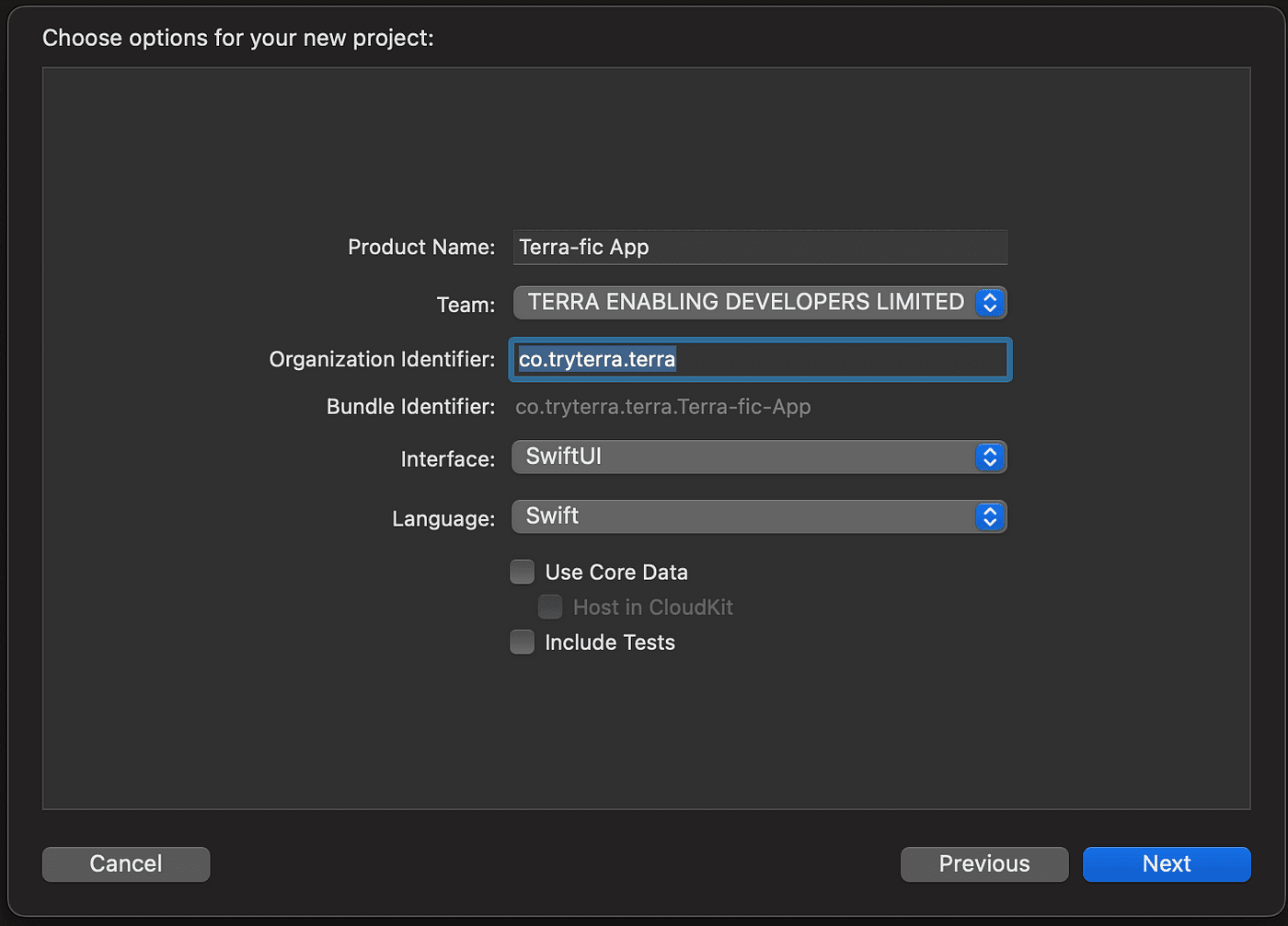
The basic app now contains an opening view called ContentView and a Terra-fic-App App struct (the entry point of the app).
Running this app on its own simply shows a blank screen with a globe in the middle saying Hello Word!. From here on, you can work off of this ContentView and start building your own views!
Structuring
Anything you want to build in the mobile app now that is visible to the user must conform to the View type. For example in the auto-generated ContentView file:
struct ContentView: View {
    var body: some View {
        VStack {
            Image(systemName: "globe")
                .imageScale(.large)
                .foregroundColor(.accentColor)
            Text("Hello, world!")
        }
        .padding()
    }
}
The struct conforms to View by implementing var body: some View. This is where you would put all the "Views". Here VStack (which probably stands for something like Vertical Stack) essentially stacks the views inside it in a vertical manner. Hence, the Image is above the "Hello World". There is also HStack which stacks horizontally and ZStack which stacks on top of each other.
The .imageScale(.large) modifies the Image to (you guessed it) a larger scale than its default size. All the views will have customizable modifications that allow changing their size, color, position, effects, etc. The best way to get to know these is to play around with them.
Creating your own View
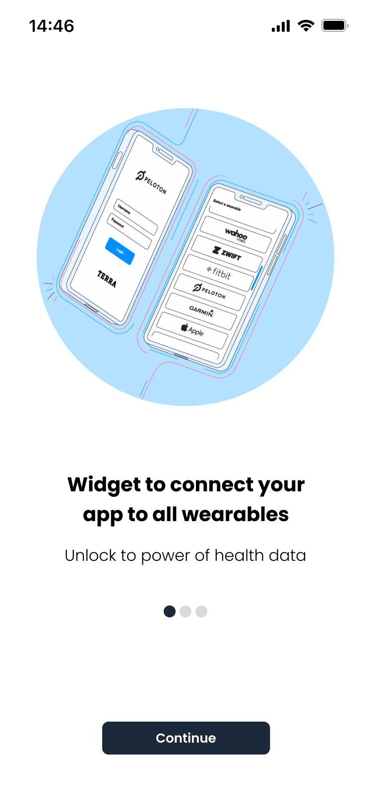
It is usually recommended to have a design before going into coding it. This way you have a picture in mind of what it should look like first. Let's say we are looking to create a very basic view like this:
We can start from the top level. A VStack will contain all the smaller views within:
struct WidgetInfo: View{
var body: some View{
VStack{
}
}
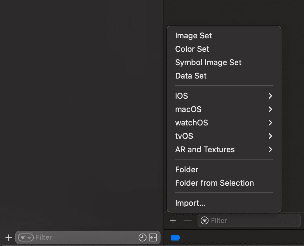
}We can then build from the top of the screen down. First things first are the image. You can import any images into your Assets.xcassets file. Simply at the bottom of the file press the little "+" and Import.
Once you have chosen the image, you should be able to see it there:
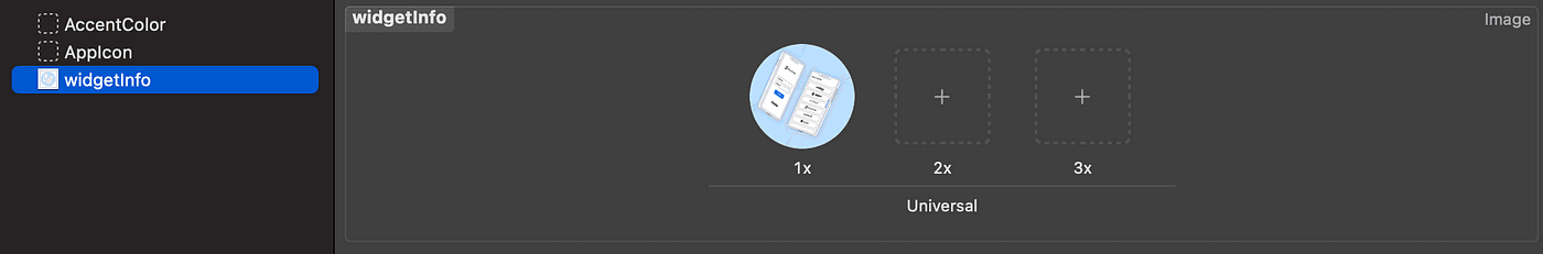
That's it! We can now use it in the view:
struct WidgetInfo: View{
  var body: some View{
    VStack{
       Image("widgetInfo")
    }
  }
}
Next, we need to include some text in the view. Simple Text("Widget to connect...") will work. However, we can also include our own fonts and style to make it look a bit fancier.
For this demonstration, we downloaded some fonts (.ttf) files and include them in our project (in a separate Fonts folder):
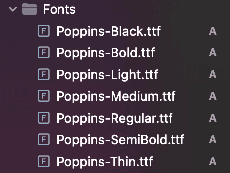
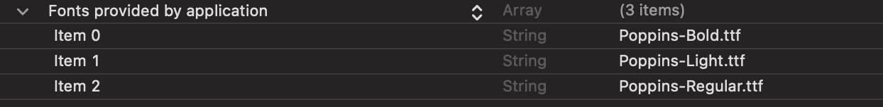
This will be recognized in our project when we include it in our Info. plistfile. Simply add a new key called (Fonts provided by the application) and include the fonts you want as values:
You should now be able to customize the text view with these fonts:
struct WidgetInfo: View{
  var body: some View{
    VStack{
       Image("widgetInfo")
       Text("Widget to connect your app to all wearables")
        .multilineTextAlignment(.center) // makes sure you have multiline centering
        .font(Font.custom("Poppins-Bold", size: 20)) // Custom font with font size
        .frame(width: 261, height: 60)
        .padding([.top], 64)
       Text("Unlock the power of health data") // Line below
        .multilineTextAlignment(.center)
        .font(Font.custom("Poppins-Regular", size: 16))
        .frame(width: 296, height: 21)
        .padding([.top], 16)
    }
  }
}
We will also add a frame around it to specify its "boundaries" as well as some padding which makes sure it's at least a certain distance away from the Image.
Next, let's build the three little dots on the screen. There are two ways of doing it. We can simply export it as an image and place it there. However, we can also create an HStack with 3 small circles. First, let's define a custom color for the light gray circle (we can just use the built-in Color.black for the first one):
extension Color{
    public static var lightGray: Color{
        Color.init(.sRGB, red: 217/255, green: 217/255, blue: 217/255, opacity: 1)
    }
}
We can then fill the circles with this colour as such:
struct WidgetInfo: View{
  var body: some View{
    VStack{
       Image("widgetInfo")
       Text("Widget to connect your app to all wearables")
        .multilineTextAlignment(.center) // makes sure you have multiline centering
        .font(Font.custom("Poppins-Bold", size: 20)) // Custom font with font size
        .frame(width: 261, height: 60)
        .padding([.top], 64)
       Text("Unlock the power of health data") // Line below
        .multilineTextAlignment(.center)
        .font(Font.custom("Poppins-Regular", size: 16))
        .frame(width: 296, height: 21)
        .padding([.top], 16)
       HStack{
          Circle().frame(width: 12, height: 12)
          Circle().fill(Color.lightGray).frame(width: 12, height: 12)
              .padding([.leading], 4)
          Circle().fill(Color.lightGray).frame(width: 12, height: 12)
              .padding([.leading], 4)
      }
      .padding([.top], 40)
    }
  }
}
Almost there! The only thing remaining the button at the bottom:
Conveniently, SwiftUI has an object called Button for which we can use:
Button(action: {
     // Perform some action here
    // We will add this later
}, label: {
    Text("Continue")
        .font(Font.custom("Poppins-Regular", size: 13))
        .foregroundColor(Color.white)
        .frame(width: 169, height: 33)
        .background(
            Rectangle()
                .fill(Color.darkBackground)
                .cornerRadius(6.5)
        )
        .padding([.top], 105)
}).padding()
We can add a label argument which is essentially the design for which we want the button to look.
Putting this all together:
struct WidgetInfo: View{
  var body: some View{
    VStack{
       Image("widgetInfo")
       Text("Widget to connect your app to all wearables")
        .multilineTextAlignment(.center) // makes sure you have multiline centering
        .font(Font.custom("Poppins-Bold", size: 20)) // Custom font with font size
        .frame(width: 261, height: 60)
        .padding([.top], 64)
       Text("Unlock the power of health data") // Line below
        .multilineTextAlignment(.center)
        .font(Font.custom("Poppins-Regular", size: 16))
        .frame(width: 296, height: 21)
        .padding([.top], 16)
       HStack{
          Circle().frame(width: 12, height: 12)
          Circle().fill(Color.lightGray).frame(width: 12, height: 12)
              .padding([.leading], 4)
          Circle().fill(Color.lightGray).frame(width: 12, height: 12)
              .padding([.leading], 4)
      }
      .padding([.top], 40)
      Button(action: {

      }, label: {
          Text("Continue")
              .font(Font.custom("Poppins-Regular", size: 13))
              .foregroundColor(Color.white)
              .frame(width: 169, height: 33)
              .background(
                  Rectangle()
                      .fill(Color.darkBackground)
                      .cornerRadius(6.5)
              )
              .padding([.top], 105)
      }).padding()
    }
  }
}
Finalising
You can move objects around to your own liking using different paddings, x offset, y offset, or even different width/height sizes. This will depend on your own taste.
For now, this will produce a View corresponding to our original design!
For our next part, we will go through linking the different Views together as well as special variables where we can change the states of a view.


