- Different metrics answer different questions — steps, calories, seconds, and scores are not interchangeable.
- Weekly rhythms are real and significant, with activity peaking at weekends and dipping mid-week.
- The Activity Score is stable but puzzling, often diverging from the underlying metrics.
All articles
Oura Ring Series
Oura activity data – Making sense of the activity score.
October 9, 2025

Stay updated with our latest research
Get the latest reports and insights from Terra Research delivered to your inbox.
By continuing, I agree to the Privacy Policy and Terms of Service.
Oura activity data – Making sense of the activity score.
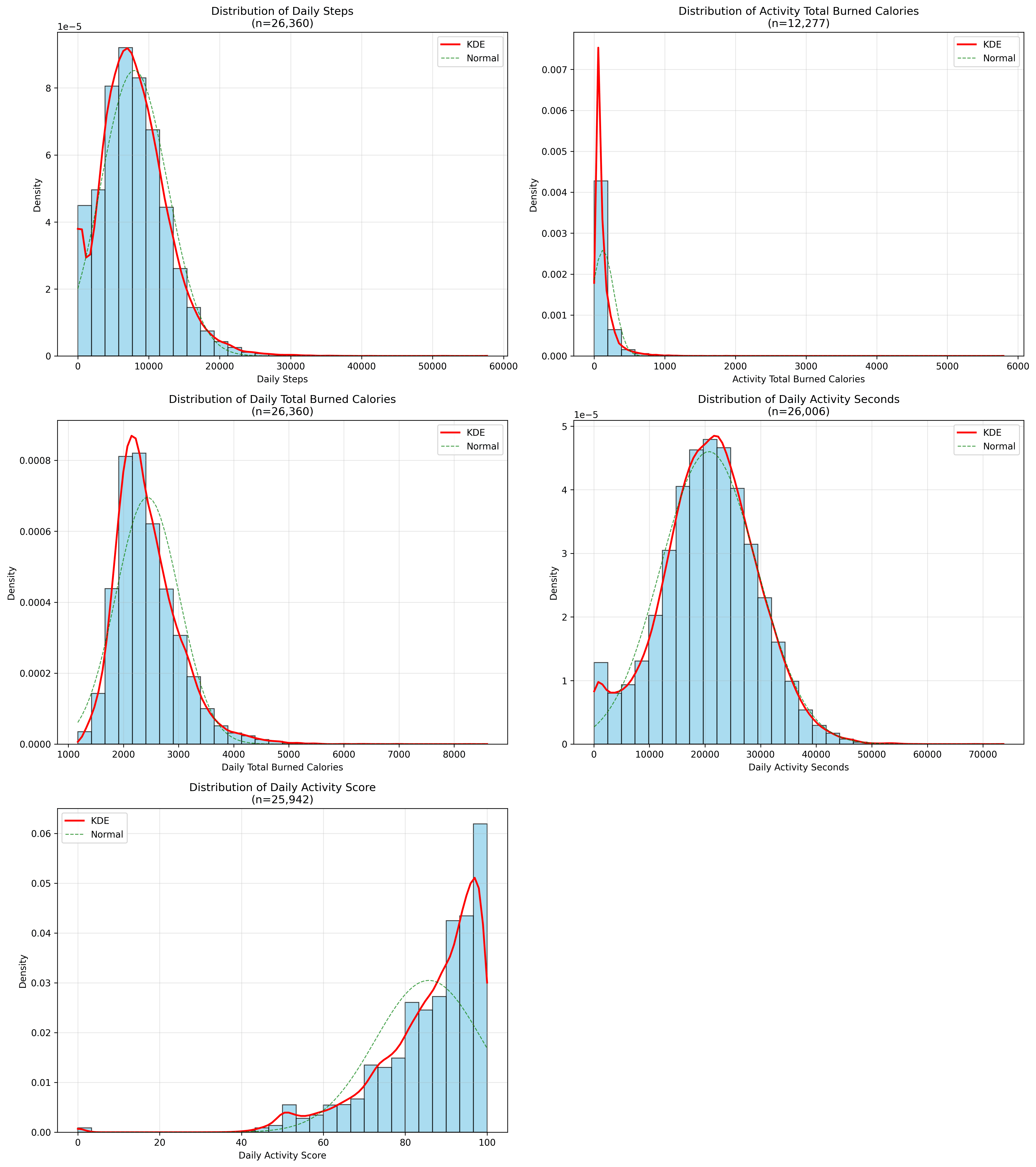
If you have ever opened the Oura app and wondered why yesterday’s “Activity score” looks nothing like the numbers beneath it, you are not alone. Oura tracks several movement-related metrics. Drawing on a recent dataset of 27,757 days from 387 ring-wearers (April–July 2025), here is a tour of the five most common activity measures, what they really mean, and when they tend to spike or slump during the week.
The five activity metrics explained
Daily Steps
The most familiar and intuitive activity metric must be Daily Steps. It is precisely what it says on the tin: a total of every heel strike Oura's motion sensor can pick up across 24 hours. In our sample, the average member clocked 7,954 steps, but the spread was wide; a standard deviation of 4,675 and a gentle right skew tell us that many users have big Saturdays, that drag the mean upwards. That is why the median (7,537) sits a touch lower and is the better gauge of a "typical" day.
Daily Total Burned Calories
Steps, however, say nothing about how hard those feet were working. Enter Daily Total Burned Calories. Oura continuously estimates calorie burn, combining basal metabolic rate with movement intensity. At 2,436 kcal per day on average, this number is likely shaped by age, sex, and body size just as much as by exercise. The distribution is again skewed right, reinforcing that calorie metrics are highly individual.
Activity Total Burned Calories
Things become more nuanced with Activity Total Burned Calories. This figure strips out resting metabolism and counts only the extra energy you spent on intentional movement. It sounds straightforward, yet in practice it is the messiest of the lot: almost half the observations are missing, and the values that do exist are spectacularly skewed (skewness = 8.18). Imagine two people who both hit an hour of high-intensity interval training while everyone else takes gentle strolls; those two workouts have a large impact on the population-level stats. It must be noted that measuring activity calories burned is notoriously challenging, so this data should be considered with a grain of salt!
Daily Activity Seconds
A steadier companion is Daily Activity Seconds. Oura tallies every second you spend above its “inactive” threshold and stores the total. With a mean of 20,697 seconds (about 5¾ hours) and an almost textbook-normal shape, this variable is refreshingly well-behaved. Because it does not care whether your “active second” was a brisk walk or a sprint, it is less vulnerable to extreme workouts and is probably more suitable for trend analysis over time.
Daily Activity Score
Finally, there is the Daily Activity Score, the headline number the app shows at the top of the screen. Oura computes it from a combination of inputs, as far as I can tell: age-adjusted expectations, recovery status, intensity buckets, and more, and translates everything onto a 0-100 scale. In the real-world data, it is the most consistent metric of all, with a coefficient of variation of just 0.15 and a left-skew indicating many people sit comfortably in the 80s and 90s, while only a few dip into the 60s. Because the score internalises body size, it lets friends compare efforts on something closer to a level playing field. It’s fair to say that it has a slightly strange distribution with steps at regular intervals.
Weekly rhythms: when the numbers come alive
If you’ve read the other blogs, you’ll know by now I enjoy looking at how the population level trends look throughout the week. Aggregating those five variables by day of the week paints a more detailed picture. Two patterns leap out:
- Weekend peaks. Activity levels surge at the end of the week. Sunday is the stand-out, posting 11.2 per cent more steps and 7.8 per cent more active seconds than the weekly average, while Saturday claims the crown for activity calories, running 11.5 per cent hotter than Monday. In short, weekends are when people stretch their legs, book the long hikes and squeeze in that gym session. No surprises here!
- Mid-week dips. Wednesday is the undisputed trough: 5.4 per cent fewer steps and 2.0 per cent less active time than the mean. Even calorie burn softens, with Thursday showing a 5.4 per cent lull in activity-related calories compared with Monday. The data hint at a natural recovery cycle. Motivation peaks on a Monday (and with it the highest activity scores), effort tails off mid-week, then enthusiasm bounces back as the weekend approaches.
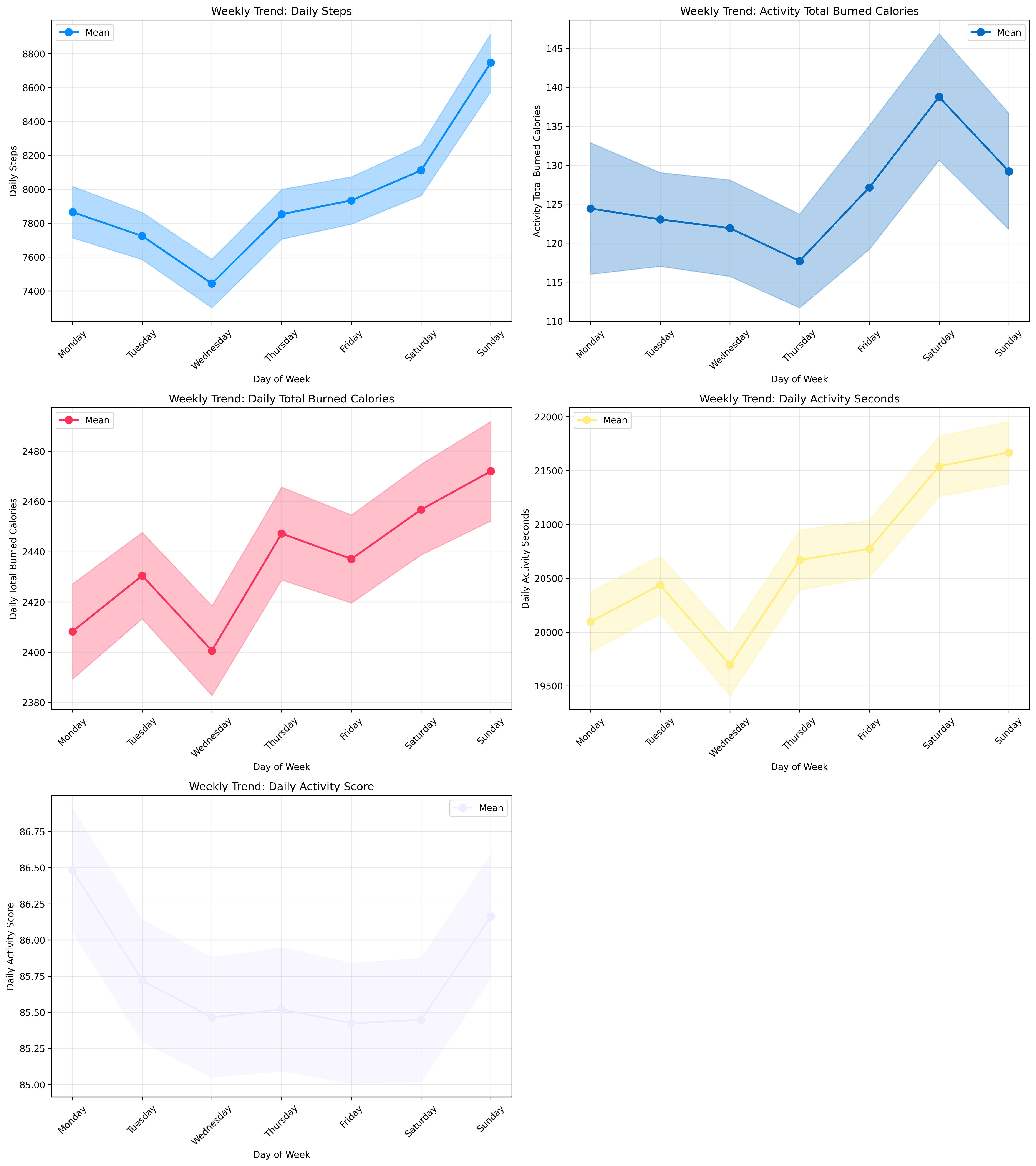
These swings are not just anecdotal. One-way analyses of variance confirm that every metric varies significantly by day (all p-values < 0.001), with Daily Steps alone registering p = 1.74 × 10⁻³⁴. In other words, the weekly rhythm is as real as it gets.
There is something strange going on in the data here that I haven’t been able to get to the bottom of. Monday posts nearly the lowest values across the individual metrics, but the highest activity score. Let me know if you can work this riddle out!
Which metric should you actually track?
In short, each metric is answering its own question: How many? How hard? How long? How balanced? And how intense relative to me? Knowing which question you are interested in could save you from chasing the wrong number and might make those rings of data feel a little less mysterious. Pick the right tool for the job. Reach for Daily Steps or Daily Activity Seconds when you want long-term habits free of dramatic spikes. Use Daily Total Burned Calories as a broad guide to energy balance, but treat Activity Total Burned Calories with caution. And finally, don’t pay too much attention to the daily activity score! We will go deeper into individual-level data in the next blog.