We use cookies to enhance your browsing experience and analyse our traffic. By clicking “Accept All”, you consent to our use of cookies according to our Cookie Policy. You can change your mind any time by visiting out cookie policy.
Instead of treating training like a simple “more in = faster out” equation, we tested where the curve bends using six months of marathon build data from 400+ runners. The results are distinctly non-linear: training volume shows diminishing returns beyond ~523 km, the benefits of easy running accelerate as it becomes a larger share of the week, and “fast” work tends to turn counterproductive above ~20%. Our non-linear model (R² = 0.79) captures individual variation that linear approaches smooth away, revealing how volume, intensity, and frequency interact to shape race-day performance.
Easy running is still the dominant lever — as lower zone training takes up more of your week, the benefits tend to build faster rather than linearly, so each step toward more easy running often pays off more than the last.
Volume has diminishing returns — total mileage helps up to roughly ~520 km per training block, but beyond that breakpoint the gains flatten and additional volume delivers much smaller improvements.
A more accurate, non-linear performance model — we move beyond last week’s linear assumptions and use a non-linear approach to fit marathon outcomes more closely, capturing how baseline pace, frequency, volume, and intensity split interact.
Non-Linear Modeling Marathon Pace
I think we intuitively know that human physiology is neither linear nor entirely predictable. Very early in my career, I remember thinking that the only upside of returning from enforced rest after an injury was the speed (read rate!) at which my fitness improved afterwards. In normal training, you don’t get better day to day; after a period of enforced rest, I felt better every session. Improvements in “Form” also seemed to happen in jumps. I’d train for months with no noticeable improvement, and then, all of a sudden, wake up as a different athlete. This all points to the fact that modelling human performance is inherently difficult, and, of course, there are many factors we don’t even know about.
If you tuned into our previous exploration of marathon performance through the lens of linear analysis, you'll remember the simple takeaways that emerged. We uncovered a world where greater training volume reliably translated into faster finish times, with each additional kilometre improving marathon time in a predictable manner. On the flip side, ramping up intensity tended to backfire, correlating with slower race outcomes. It was a broad-strokes approach, averaged across a diverse cohort of runners, with a simple conclusion: prioritise those steady miles, ease off the throttle on high-effort days, and watch the progress unfold.
As satisfying as those linear insights were, they are inherently limited. By smoothing everything into a single slope, linear models treated every runner as an interchangeable data point on a grand average line. They, of course, don’t capture the individual variation: the low-volume enthusiast who surges ahead with targeted intensity, or the high-miler whose endless loops yield only marginal returns because their easy days are too few.
That's where we pivot today, delving deeper into the terrain of non-linear modelling. Here, we're not just averaging trends; we're trying to honour the unique physiological narratives of each athlete, segmenting the data to reveal accelerating benefits, sudden breakpoints, and synergistic interactions.
Drawing from the same rich dataset as last week's blog (6 months of activity data on 425 runners in the lead up to a major marathon in 2025), we’ve experimented with techniques like piecewise linear regressions, square root transformations, and multifaceted interactions. What unfolds is a more detailed picture: why volume's promise tapers, how easy training's rewards compound, and the ways your weekly run frequency or innate speed can warp the entire equation.
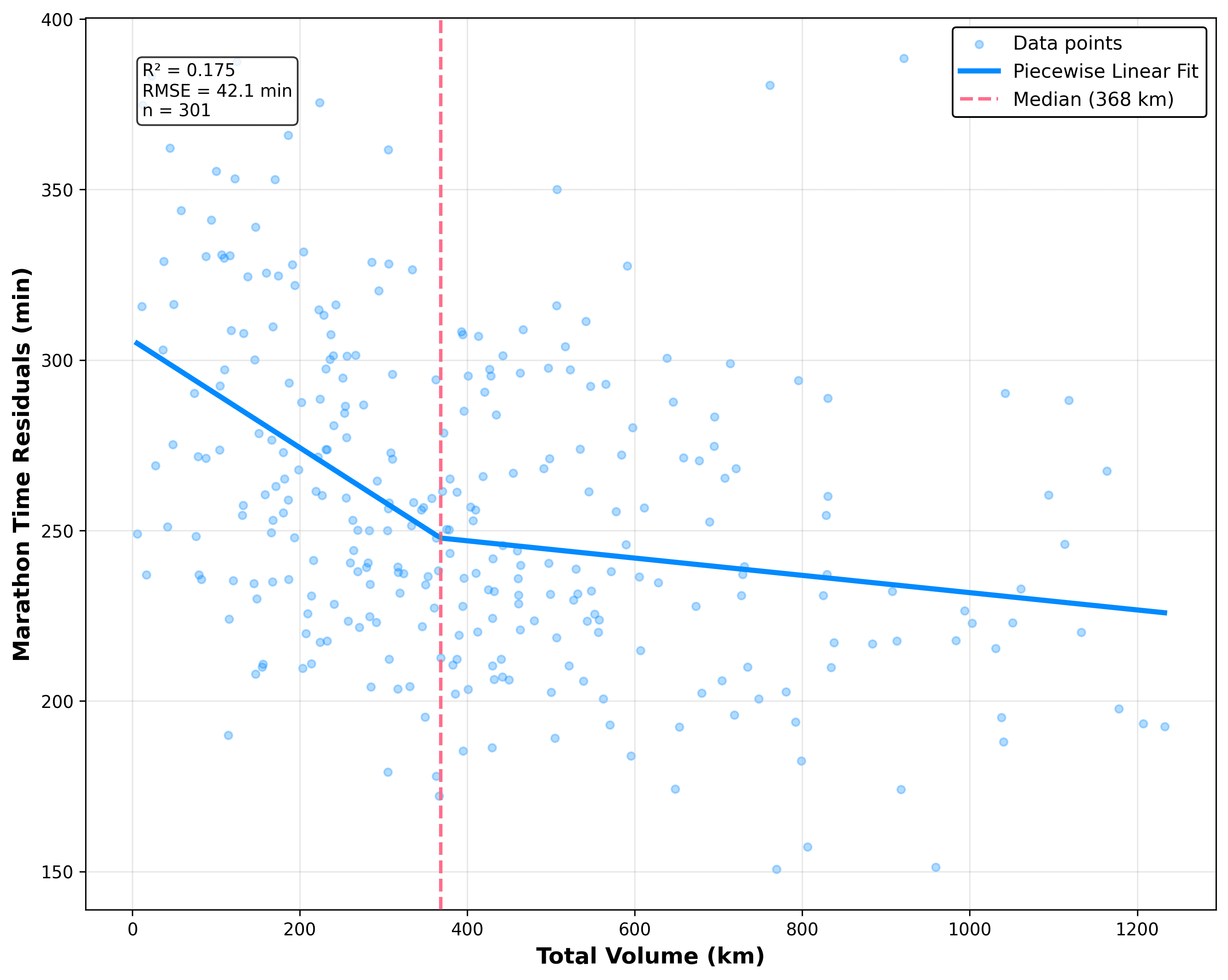
Figure 1: Piecewise Linear Fit of Marathon Time Residuals vs. Total Training Volume. Scatter plot of the relationship between total training volume and marathon time
The best fit for the volume-improvement relationship was a piecewise linear model, with the population median as the breakpoint at 523 kilometers. For those building at low volumes (≤523 km), the coefficient is +0.0081 minutes per kilometre, meaning 100 kilometers of training could reduce your time by around 12.8 minutes. Cross that threshold into high-volume territory (>523 km), and the landscape flattens: -0.0057 minutes per kilometers translates to a more modest 0.57 minutes saved per 100 kilometers, or about 3.2 minutes total.
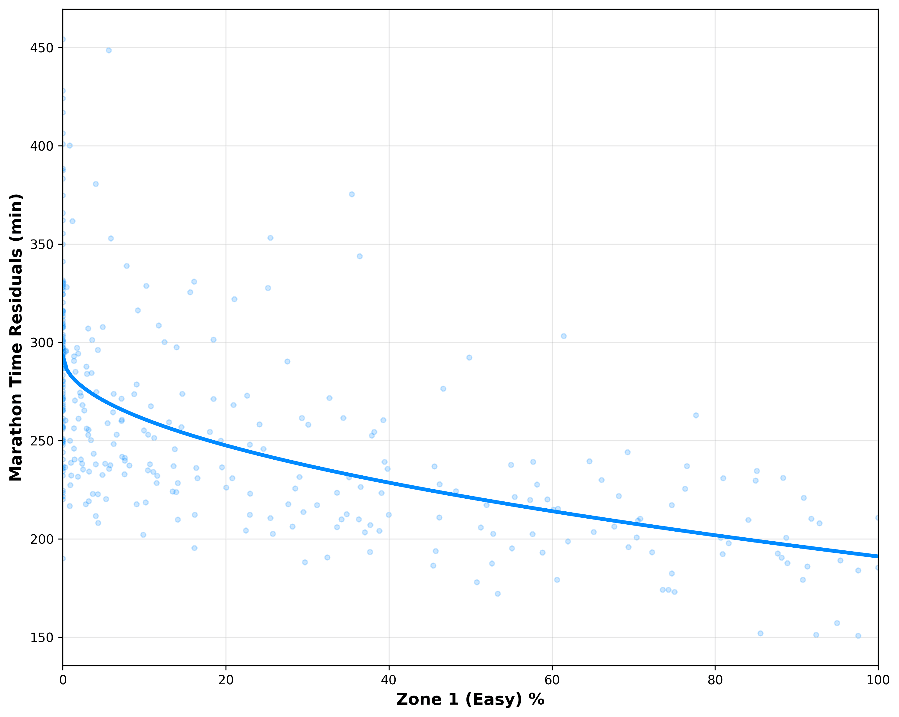
Figure 2: Marathon Time Residuals vs. Percentage of Easy Training (Zone 1) This scatter plot shows the relationship between the percentage of total training spent in Zone 1 (easy/aerobic/conversational effort) on the x-axis (0% to 100%) and marathon time on the y-axis.
Easy training exhibits accelerating, non-linear benefits: each additional percentage point of Zone 1 work delivers progressively larger performance gains as the proportion increases. This square-root-like pattern indicates that moving from 40% to 60% is typically easier and yields a larger improvement than moving from 0% to 20%, and that pushing toward 70–90% continues to yield meaningful returns.
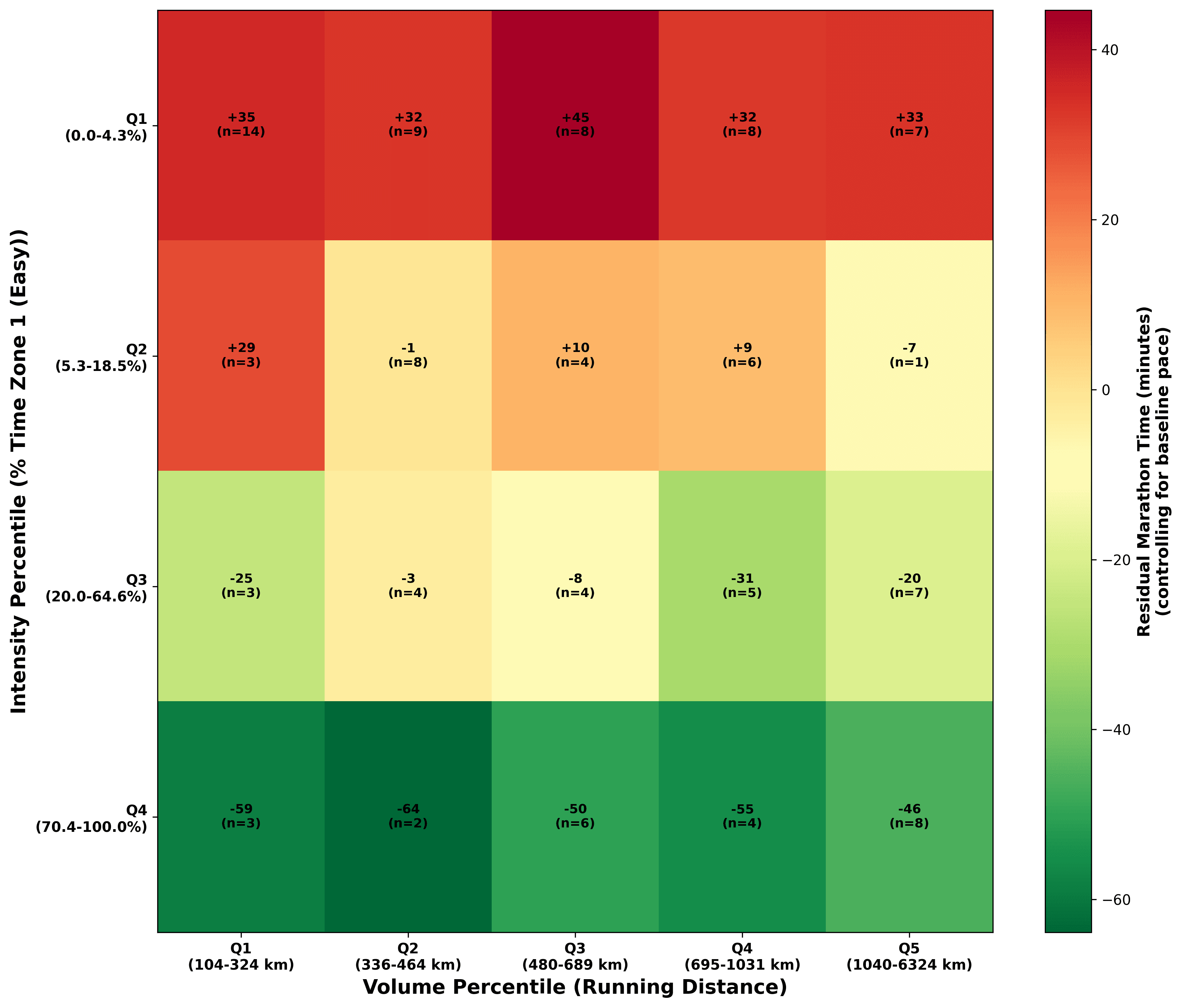
Figure 3 demonstrates the idea that aerobic/easy volume is the primary driver of marathon success beyond baseline level, and that skimping on easy running is one of the most reliable ways to leave huge potential on the table. In practical terms, it visually confirms why elite and high-performing recreational marathoners gravitate toward 65–85% easy training: the curve rewards aerobic dominance far more than balanced or intensity-heavy approaches.
Figure 3: Volume × Easy Intensity Heatmap – Impact on Marathon Performance (Baseline Pace Controlled). This heatmap shows how total training volume (km) and percentage of easy/Zone 1 training combine to affect marathon performance, after controlling for each runner's natural baseline pace.
The most striking pattern in Figure 3 is the near-uniform deep green across the entire bottom row (Q4: 70–100% easy), regardless of whether volume is low or extremely high, meaning runners who make easy/aerobic training the overwhelming majority of their workload consistently outperform their baseline by 46–64 minutes on average.
In sharp contrast, the top row (Q1: 0–4.3% easy) is almost entirely deep red (+32 to +45 min residuals), showing that very low easy proportions lead to severe under-performance even among high-mileage athletes (look at the top-right cells). Within each fixed volume level (each column), moving upward toward higher easy percentages yields large, consistent gains from red to green. Volume itself adds the most benefit precisely when easy training already dominates; without that easy foundation, adding more kilometers often yields little improvement or even worsens outcomes.
Importantly, the intensity distribution effect seen here is not just about volume; it holds across the entire volume spectrum, meaning that prioritising a very high easy percentage delivers outsized advantages even for lower-volume runners, while very low easy percentages produce disappointing results even for those logging extremely high mileage.
This reinforces how runners allocate effort (especially the dominance of easy aerobic work) is more determinative of marathon success than sheer quantity of kilometers alone.
Get the latest Terra Research reports and insights every week as soon as they're published.
This is all very interesting, but at Terra Research, we aim to build products that help people live healthier lives and perform better. In the last blog, we built a marathon prediction model that predicted marathon performance relatively inaccurately. Can we do better with more advanced techniques?
We changed our approach here to use the number of runs per week as the base. This is because frequency reflects real-life constraints—recovery windows, work schedules, family time, injury risk—and it strongly shapes how intensity should be distributed for optimal results. First, we looked at the intensity distributions that led to the best performance at each frequency level. You can see this in the table below.
Runs/Week
Zone 1 (Easy)
Zone 2 (Moderate)
Zone 3 (Fast)
Total Volume
Avg Run Length
Marathon Time
Potential Improvement
<1
19.3%
28.1%
52.7%
151 km
15.7 km
239.9 min
61.5 min
1-2
31.2%
45.2%
23.6%
365 km
12.7 km
215.7 min
53.2 min
2-3
40.8%
38.7%
20.5%
480 km
11.7 km
210.6 min
46.6 min
3-4
63.5%
30.0%
6.4%
641 km
11.9 km
187.4 min
48.0 min
4-5
76.2%
20.7%
3.1%
921 km
11.3 km
192.5 min
50.1 min
5-7
75.2%
20.7%
4.2%
702 km
11.6 km
176.5 min
60.6 min
7+
88.0%
9.0%
3.0%
2,345 km
11.8 km
174.9 min
53.2 min
The table shows a clear pattern: at low frequency (1–2 runs/week), training needs balance. That means higher proportions of moderate and fast with longer average runs in order to extract maximum benefit from limited sessions. As frequency rises (3+ runs/week), the pattern shifts dramatically toward extreme easy dominance (63–88% Zone 1), with fast work dropping to just 3–6% and moderate receding. Volume scales with frequency, but average run length stabilizes around 11–12 km beyond 2–3 sessions, emphasizing consistency over forcing ultra-long efforts.
The Model
After extensive work and experimentation, we identified a model approach that delivers slightly more accurate predictions than its linear counterpart. Achieving an impressive R² of 0.7933, it explains nearly 80% of the variance in marathon finish times, with a root mean square error (RMSE) of just 18.32 minutes and a mean absolute error (MAE) of 13.83 minutes.
At its core is an equation that starts with an intercept of 41.77 minutes and adds a dominant baseline pace term (+30.58 min per min/km slower pace), then layers in piecewise volume effects (minimal impact below 523 km, small but meaningful gains above), a square-root transformation for Zone 1 easy percentage (capturing accelerating aerobic benefits), piecewise fast training penalties (beneficial below 20%, harmful above), runs per week, and four critical standardized interactions that reveal how volume amplifies easy training's advantages while magnifying fast training's risks, and how faster baseline runners extract disproportionately large gains from both volume and easy work.
What makes this model particularly powerful is its ability to reflect physiological reality rather than average trends. Baseline pace remains the strongest single driver, but training effects are far from linear: easy running delivers compounding returns as its share rises (e.g., jumping from 40% to 60% easy can save ~7.2 minutes more than earlier increments), fast work flips from slightly helpful to clearly detrimental above 20% (adding 10% fast beyond that threshold costs ~5.3 minutes), and volume shows classic diminishing returns with a breakpoint at ~523 km.
These interactions add crucial personalization, faster runners benefit more from piling on mileage or easy miles, while slower runners see smaller (but still positive) effects, ensuring the model adapts to individual ability. In practice, this equation enables precise "what-if" simulations: enter your current baseline pace, volume, zone splits, and weekly runs, and instantly see the predicted time, plus how shifting 10% from fast to easy or adding one recovery run might shave minutes off race day.
By encoding the non-linear truths of endurance physiology, this model doesn't just describe what works on average; it predicts what could work best for you. Whether you're a time-crunched runner juggling 3 sessions a week, a high-frequency enthusiast stacking 7+ runs, or someone rebuilding after injury, the equation adapts, revealing precise trade-offs and upside potential in real numbers.
At Terra Research, this is the kind of insight we build toward: data that doesn't dictate, but hopefully illuminates a clearer, healthier, faster path. Next week we’re excited to launch a marathon pace calculator based on this model, so you can plug in your baseline pace along with how often you run, how much you run, and how hard you train, and get a realistic estimate of race day pace.
Summary questions
How much faster will more training volume actually make me?
It depends heavily on where you're starting. Below the population median of 523 km over six months, every 100 km of training cuts about 12.8 minutes off your marathon time — but above that threshold, the same 100 km only buys you roughly 3.2 minutes. Volume has a clear breakpoint, and chasing mileage past it yields diminishing returns unless paired with the right intensity mix.
What percentage of my running should actually be easy?
As high as you can sustain — the data shows accelerating, not linear, returns. Runners in the top quartile of Zone 1 proportion (70–100% easy) outperformed their baseline by 46–64 minutes on average, while those in the bottom quartile (0–4.3% easy) underperformed by 32–45 minutes, even at high mileage. Moving from 40% to 60% easy alone can save about 7.2 minutes more than earlier increments, which is why elite and strong recreational marathoners cluster at 65–85% easy.
Can I get away with more intensity if I only run a few times a week?
Yes, and the data supports it. Runners doing under 2 sessions per week performed best with 23–53% fast work and longer average runs of 12.7–15.7 km, extracting maximum stimulus from limited time. But once you cross 3+ runs per week, the optimal mix flips hard toward 63–88% Zone 1 with fast work dropping to just 3–6%.
Is there a point where fast training starts hurting my marathon time?
Yes — 20% is the inflection point. Below that, fast running is mildly beneficial; above it, every additional 10% of fast work costs roughly 5.3 minutes on race day. The model treats this as a piecewise penalty, meaning high-intensity sessions stop being neutral and become actively counterproductive once they dominate too much of your week.
Can wearable data actually predict my marathon time accurately?
Reasonably well. Built on six months of activity data from 425 runners preparing for a 2025 major marathon, the non-linear model achieves an R² of 0.7933 — explaining nearly 80% of variance in finish times — with an RMSE of 18.32 minutes and MAE of 13.83 minutes. That's a meaningful step up from linear approaches and accurate enough to run useful what-if scenarios on volume, intensity splits, and run frequency.
Why am I logging huge mileage but not getting faster?
Almost certainly because your easy proportion is too low. The heatmap analysis showed that runners in the lowest easy quartile underperformed their baseline by 32–45 minutes even at very high volumes — the top-right of the volume spectrum stays deep red without aerobic dominance. Volume only compounds when easy work already forms the foundation; otherwise additional kilometers can yield little or even worsen outcomes.
Does run frequency matter more than total volume?
Frequency shapes everything else. As weekly runs climb from under 1 to 7+, optimal Zone 1 share rises from 19.3% to 88%, fast work collapses from 52.7% to 3%, and total volume scales from 151 km to 2,345 km — yet average run length stabilizes around 11–12 km past 2–3 sessions. Frequency reflects real-life recovery and injury constraints, which is why the model uses it as the base variable for personalized recommendations.
Do faster runners benefit more from extra training than slower runners?
Yes, and that's one of the model's key interactions. Baseline pace is the single strongest predictor (+30.58 min per min/km slower), but faster runners extract disproportionately large gains from both added volume and higher easy percentages. Slower runners still improve, just with smaller absolute returns — meaning the same training plan produces meaningfully different outcomes depending on where your current fitness sits.